You are Here:

Show Posts

This section allows you to view all posts made by this member. Note that you can only see posts made in areas you currently have access to.


Messages - whaam

Pages: [1] 2 3
1
Hey all...
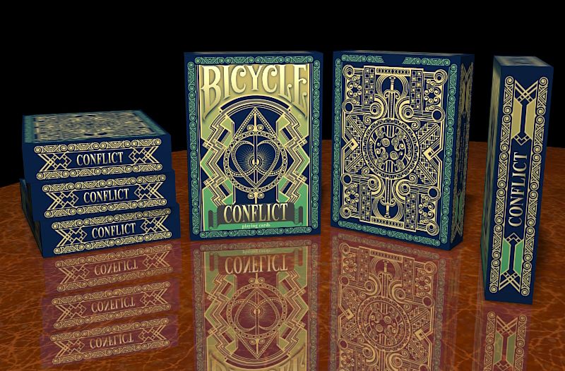
This is a preview of my newest design, Conflict playing cards.. We'll be starting a Kickstarter campaign in a few days, hope you'll come check it out.
Thanks...
Johnny

2
 :D Typo..., made me laugh...hehe

These are nice Chris. Lovely cards, designs. You put a lot of work in your art, I've seen Dia de los muertos cards, imaginative work there too, I especially liked the Joker there.

However, VIP...are actually brooch designs (looks to me), even though they look great like this, not sure the card collectors will want these. Just my opinion. I'd like to be wrong here.

Few suggestions that might increase the support on KS...
A mock-up pic of tuck would be nice. You've got a flat tuck pic there, but a 3D pic is better. Also, the back, you're not gonna have the back pic on tuck?

Speaking of card Back, that one looks kinda like my Phenographic back, with less details  ;) and that's cool. I just think it does look too simple, would've prefered to see more stuff, design there.

I think you don't need the center line that divides the mirrored image on faces. So much better without the line.

And, you kinda have too few rewards. Only 3. Backers usually like to choose from many options to pledge, not to say that you don't have early birds or some special offers.
And,...14 euros for 1 deck will probably be too much for most (not sure if that includes shipping, it's not too much if it does), since it is a MPC deck I guess you could've gone with a lower goal too. Also, put euro/$ exchange rate on KS page, people don't like to calculate that much  :)

Johnny

3
Playing Card Plethora / Re: Once Upon a Time Playing Cards
« on: September 04, 2015, 10:16:03 AM »
 :) The flipping card in hand thing is still something I'm trying not to do while holding an ace (upside down), but sometimes I can't resist doing it.

Given the history of playing cards, I can agree courts sometimes may be done one way. Works well in some cases. This design is one.

Yeah, I understand, I'm gonna try to comment more current events, projects from now on.

Johnny 

4
Playing Card Plethora / Re: EGYPTIAN GLYPHS (KS)
« on: September 04, 2015, 09:49:37 AM »
With that background, the designer probably wanted to say these are hieroglyphs etched into stone. But that's not the way. You shouldn't use a photo for background on such design,...nor should you use a photo of sand for the background on tuck.

The J on Jack does look like an upside down deuce (or mirrored), could be confusing for players.

The design of courts however is very nice. The upside down look on Kings and Queens (half of design) doesn't bother me at all here. Even if the feet go to the shoulders on mirrored pic, it's still well connected. Looks great.
    What I wouldn't use on this design...is the bevel effect on pics. Really unnecessary.

Back looks nice (would be nicer without the background photo).

This guy had Aztec art (history) to offer, now Egyptian..., I expect Greek to be the next. I admire that he's trying to reproduce their illustrations (or paintings, drawings) in an truthful, coloristic art expression.

Johnny

5
Playing Card Plethora / Re: Indictus (KS)
« on: September 04, 2015, 09:17:49 AM »
Overall, I like this design...but...
Let me start with good things, I do like the theme...Shakespeare and all. The tuck looks great but..most of it is an old style wallpaper design.
Other ornaments do make it look great though.

Back is perfect, it has depth, really nice, I see the snake.
Indices and pips also perfect as the overall design of cards.

What I don't really like..., are the court cards. The drawing style don't match the rest of design. Too sketchy, should've been more precise line work and a little more skillful.
That wrapping ribbon in center also a bit too wide, I expected to see some text there.

Aces look great.

Johnny

6
Playing Card Plethora / Re: Bellezza (live on KS)
« on: September 03, 2015, 06:20:41 PM »
 :D I get you, too much text, I know. I don't expect anyone to read this but Don. We have a discussion going on and hopefully we're finally done, I hope.

Thanks Justin
I really toned down the yellow and made it look like gold, gradient. As I have much experience with printing 11 (or more) decks with USPCC and the printing always comes a little darker, I'm taking that in consideration while designing. The yellow (gold) color shouldn't be too bright (if that's how it looks on screen) when printed. There's some close ups on KS page, that's how I expect it to be.

Johnny

7
Playing Card Plethora / Re: Once Upon a Time Playing Cards
« on: September 03, 2015, 05:54:38 PM »
Success on KS few days ago. I was watching this one, wondered how it'll do on KS.
I guessed that a girl is a designer here (and not only because the Prince doesn't have clothes  :),...was right, I think. Nice job.

I like painted decks, nice colors and theme. The theme is actually what sold the deck. Back is in a different style, good for the first time but doesn't really match the artwork. I don't see the tuck.
        I see the artist's skill in painting is not at a top level, this is somewhere in between painting and children's book illustration but...., with such theme, that might be intentional...and it worked.
These guys had 1 design before, interesting, another girl designer, similar theme...and a successful project there too.

Both decks have one way courts,...that's not something I would prefer. I got a tons of paintings that could go one way on card, don't work well if mirrored. Playing cards should have mirrored images. Otherwise they're like art cards (or "aceo").

Johnny
 

8
Playing Card Plethora / Re: Bellezza (live on KS)
« on: September 03, 2015, 04:52:49 PM »
@Don
The fact is.., you're not reading my posts properly.
The fact is..., you're blowing things way out of proportion.
The fact is..., you're a spin doctor (deliberately overlooking what we agree on and pushing the thing that you haven't proven yet, only thing (1), that we disagree on)

And on reputation points, that's a semi-humorous subject for me, insignificant. We all know how that works. What is relevant is the fact that 249 people do like my design (if we're talking about numbers).
              What I do care about, here and everywhere else, is when someone has a constructive critique for me, words that can help me do better designs, designs that you'll be satisfied with ("you" meaning everyone..., or most).
       
Constructive critique,...on Bellezza design came from Fes here (example). That's how it's done. I responded well to that, didn't I?
I do the same on other people's designs, threads (read my posts on Mythical or Devastation, Beetles...).

When I posted this thread, I wrote 1 sentence, and said..."ain't it nice"(?). Then Don says, "no, it ain't..., and it's got a serious flaw..."
Not a word about everything else,....how about the pips, custom courts, tuck, back... Isn't it visible how much work is put into it? At least that.
    You only focused the negativity in one sentence...on one thing.

And there's only one thing we are disagreeing on (even though you make it sound it's everything and that I don't accept facts). OK, maybe two..., the other one is realistic conditions of play. I don't see how cameras and cellphones fit in there. That's cheating, ain't it?

The experiment that had this whole thing started has developed into another (same but with more cards): Today I mixed and shuffled 26 cards with black back and 26 with white back (design with same faces). I have placed 20 cards on the table (faces up), side by side (5x4 cards). Not looking at the cards from an inch of distance, but from where I sit,...I tried to guess (see)...over and over again and get it right on all 20 cards (which has white, which black back). I've done this for more than an hour...
    I cannot see the face down edge (in this case, back down). Period. That's the fact.

If anybody else can try to do this and tell me what they see (if they can guess, see the 20 cards face down edge color), the way I described it... If you can get it (see it), then I...(and 5 other guys) will have to go and see an eye doctor. Cause we surely can't. (maybe I need a reflective table?)
(now, would I really say this if that in fact is not what I see on my experiment ? Or am I still doing a spin thingy?)

(btw, the decks I've done this is Elegance, white back and black back)

I was hoping we can conclude this discussion until such experiments are done. I still respect Don's and everyone's position, opinion.
Thanks

Johnny

9
Playing Card Plethora / Re: Devastation Playing Cards
« on: September 02, 2015, 12:14:53 PM »
I agree, since that's a series of decks,...it's only logical to offer a reward with Innovation decks too. For those who missed out on previous campaign.

Courts are nice, consistent style as on previous designs. Pips also nice, only slightly changed from Innovation. Not too thrilled about ornaments in corners but liking the dirty background.
It's also gonna be a deck one can learn from, not sure if I knew..that guy was the inventor of the tank (not his whole story for sure, the pic made me read the article on Wikipidea  :))

Johnny

10
Playing Card Plethora / Re: Bellezza (live on KS)
« on: September 02, 2015, 11:49:16 AM »
The choice of phrases and the way you use phrases Don, (such as the one with..air) to prove a certain point, was incorrect. Not a big deal, happens. Also, the phrase "for those who choose to see" in this context is...incorrect. If you wanted to imply that I...don't want to see what is visible, you should've said..."those who choose not to see", that's the correct phrase here.
     (Cause "choosing to see" might be interprated in the way that someone sees what is not there..., "so he chooses to see" (mind tricks him into seeing what isn't there but wishes it were, or thinks it should be there))    (some of you might find me to be nitpicky here, right?  ;))

Reputation points,...there's no way I'll get in plus (above zero) while I'm disagreeing with such proficient posters. I guess I'll just have to do what I am doing, tell it how I see it...and take the negative points  :(

And lastly,....I thank you for posting a link to the video (which is great, watched it all) and once again proving that we don't disagree on some points..., and that is a good thing.
1. I already acknowledged from beginning that the deck, if you look the side of the deck, yes..., it'll have a "dirty" look. Meaning, Yes, if you choose to pick a card from the deck (like you did on the video) you will be able to pick (face) red and/or blue card.
2. On Bellezza deck, picking from a side of the deck,...you can only pick red or blue (face) and that's 2 suits, 26 cards red or 26 blue.
You will NOT be able to say which is the court card as courts and numbers have same frame and colors (26 each)
3. In realistic play conditions, while shuffling and dealing the cards..., you can only try to guess what color (26 cards) comes next,....doubtful you could see even 1 coming to you or other player...

4. and finally..., the one that I'm talking about all this time: (assuming nobody could see what whas dealt (99% sure)), if you hold a card fan in your hands or you have 5 or 2 cards on the table, single cards, face down...or faces looking at you,...it is IMPOSSIBLE to say what card is (face) blue or red.
I see you don't have that experiment there, in video. Try it and let me know if you can detect the card. (truthfulness is my middle name  :D, I would say it if I could see the edge that way. After all, finally, Bellezza is over the funding goal so it goes to print !!! Yes!)

There are good things coming from this discussion, my future designs will probably have a mini frame (in some cases, when I want to do designs that extend to the edge), mini border that would prevent issues like this arising among card collectors (and others), though I still believe (I know it) Bellezza will be as playable as any other deck.

Johnny
11
Playing Card Plethora / Re: Devastation Playing Cards
« on: September 01, 2015, 10:35:34 AM »
Looking forward to see the rest of cards...cause this here looks awesome.
With Golden Spike and a locomotive on tuck and Innovation and oldtimer (car)...I expected to see Wright brother's aircraft here  ;)

Graphic work Jody does is great, it has that old, classic feel..., drawing style to it.
These look modern, I like the back design. (Limited) Tuck was probably done in black ink first and then you played with colors and went with red..., right? Right,...that's how it's done. Doesn't matter, looks great.

With the inventors series I would've thought this one would be called Creation, Imagination or Rennovation,..not, hmm, Devastation, such a powerful word. Though, looking at the Ace of Spades there, I kinda have a feeling what...it is about (!) (Man's best at Man's worst, I get it...)

I have no doubt this one will be a success.

Johnny

12
Playing Card Plethora / Re: Bellezza (live on KS)
« on: September 01, 2015, 10:03:11 AM »
@ Fes
Thanks for backing,...I understand what you mean.., regarding jagged edge (line) of the frame. I first went with much softer design, lines.., just slightly curved, then I tried what I have now and I liked it more, cards were more "vibrating" for me..

@Don
"I don't see air, but it exists", actually speaks in favour of my argument, doesn't it  :)   "I don't see the inside edge"..., but I know it's there, existing,...of course.
(We kinda transcended the simple design debate into a philosophical discussion here, or maybe just a scientific..., depending on how you percieve the angle of expression of the sentence in question... ;)  Just kidding, I believe I deserve at least 1 reputation point for this, don't I...?)

I guess we're gonna have to agree not to agree on this one..., and there's nothing wrong with that. We respect each other's position and that's cool with me.
It's now 6 people that I've tried this with (including me), 5 cards on a table and no one can tell which is which (black or white back, same courts, a Bicycle deck also)


13
As a designer, I gotta say I really like this deck. This,...is a good design. Well balanced, every card unique. Adam, nice job...and on a first deck.
I don't know the guy..., but I hope he makes it to the goal.

Beetles, I don't like (do I?) and most people don't..., but the theme here is that much interesting.., cause it's well done. You almost  ;) made me like beetles. Well, I'm kidding,...I love all creatures, ants and rabbits and...horses,....zombies,...I don't like zombies.

Sword and crowns with beetles for courts, nice also.

I prefer the light deck and for the dark..., it would've been so cool if it was black cards with gold beetles on, tuck also.

Johnny

14
Playing Card Plethora / Re: MYTHICAL playing cards live on Kickstarter
« on: August 31, 2015, 08:15:20 PM »
I might just add that I think the characters here are colorful and fun, dynamic courts. I think the tuck case and back should've been also, colorful. (I'm not a big fan of the style though..)

And, I see these characters are the same as in a card game they had on KS 2 months ago, World of Mythology (funded). Whoever backed that game might also want this deck (now also funded, I see)

15
Yes, original artwork is really something. And to see those pics (originals, done by me..) on playing cards with adapted design made for playability purpose...., does change the perception of artwork itself,...nothing like the real thing.

Quantity matters only regarding sales, I'm very much aware of that. But quantity has absolutely no effect on my quality of work delivered on every design (or anything else I do). This is the optimal amount of work for me,...a lot..., yes..., would be too much for most, probably,...not for me though  ;)     
    As for sales, well what can I do,...I just want to offer to the world my creations, every time I work on one design...I get an idea or two for the next one. And I gotta do them right after I'm done with the first one,...I can't stop!!  :D

Old Masters, we just wanted to offer those to people clicking on projects on Kickstarter,..people that missed that project, this way they can get 3 (coolest) art decks at one place, same artist. A bunch of campaigners are doing the same... Just an optional add-on.

Johnny

16
Playing Card Plethora / Re: Bellezza (live on KS)
« on: August 31, 2015, 07:23:05 PM »
I can agree with most things said here, and of course, I know all the rules of design,...after all this is like my,...15th or so deck design. I wanted to do such deck, unlike any other I did.. So I bent 1 rule...a bit.

Only thing I don't agree with,...I say it's impossible to see the edge if cards are in hand, card fan, regular play,...or face down on table, 2 or 5 cards. I cannot see it...and I gotta have a perfect vision with what I do.

As Bellezza is very close to funding (will be funded for sure)...let's all just get ourselves 1 deck and see for real if it's possible to see the inside edge, blue or red... ( ;) kidding, just kidding guys..., thanks to backers so far, if anybody else wants it...., we got 7 more days of campaign..., if not I appreciate if you've just looked at the design,...there'll be one that you'll like for sure (my designs, that is...)

Johnny

17
Playing Card Plethora / Re: Bellezza (live on KS)
« on: August 31, 2015, 11:59:38 AM »
Oh yes it is  :)

Not a flaw,...I already explained this on another forum where I did an experiment with black and white backs (more difference than blue and red color then), but same courts.
In realistic play conditions you will not be able to tell which suit card is somebody holding in hand by looking at edges. I have played, I gave people a card fan to look at, put 5 cards on table (and more) and said..., (with faces up, backs down)..."now tell me which card has white, which has black back". Nobody guessed, nobody could detect,....impossible.

In a deck, dealing cards, in realistic conditions you won't be able to tell which card comes next, red or blue faces (inside edges, cause edges are actually cut, gray).
If you put the deck in your eye level, then yes, you'll see the "dirty" look of the deck from a side. Same will happen with any deck that has artwork extending to the edges, or patterns used or maps, dirty background etc. (decks live on KS, like Leonardo, Mythical etc.).

The difference is that here, half of deck has blue, half red faces (borders, two suits each color) so realistically,....you won't be able to guess in almost any conditions what card suit (!) goes to who at a certain time (and...what card, impossible !),....when cards are in hand...it is impossible to see the inside color of the edge.... IF..a player doesn't show card faces to the other player  ;)

Johnny

18
Don, dude, if you don't see quality in my deck designs.... :o, maybe you should look closer. I respect your attitude if you just...don't like my designs. That's another thing. Has got nothing to do with...quality matter.
The fact that I work a lot doesn't effect the quality negatively, in fact it enhances the quality of my designs.

If Vincent deck or Michelangelo deck don't work for you, I can only assume you don't like the art (or don't care about it) of those two painters. Cause if you look for the paintings Vincent painted and my designs (paintings) you'll see how close did I go with reinterpretation of his work.       
Not to speak of Old Masters where is clear (to...anybody) how much quality work is put into those courts.
And Sistine, wow, first time somebody did this with most famous frescoes...

@Purpleice
No, this is a project for two new art projects, deck designs, 1st campaign for Sistine, 2nd for Vincent's Royals.
Old Masters decks are just offered as add-ons for backers that don't have those and maybe they'd like 1. So they can have all three of my Art decks, homages to the greatest painters in the world.

And, Sistine and Vincent's Royals are such wonderful ideas and fantastically designed decks, hope most of you will recognize that.. (actually, I know you will  ;))
Thanks

Johnny

19
These are awesome..., and not because I'm the designer  ;) (I couldn't find a thread, hope it's first)

https://www.kickstarter.com/projects/2104052526/bicycle-sistine-and-vincents-royals-playing-cards?ref=nav_search

Johnny

20
Playing Card Plethora / Bellezza (live on KS)
« on: August 30, 2015, 12:49:26 PM »
I couldn't find this one here. Ain't it nice,....and not because I'm the designer  ;)

https://www.kickstarter.com/projects/2104052526/bicycle-bellezza-playing-cards?ref=nav_search

Johnny

21
Thanks,
I'll make the changes on all cards and will show some pics this week..

Johnny

22
Thanks for your suggestions, very helpful indeed.
_Different shades of green, more variations really make the difference, background stays in the back...
_Also boxed K and small pip (maybe white box?)
_Pip with white might be better
_King and frame is lighter green too so it brings more depth overall

I tried to change green to a colder green, do you guys prefer that one?

I'll try to play with more shades of red (and maybe green if it'll work) on the back too, to make it even more complex..

Will do some small design changes on tuck too,...(not yet sure if I'll go with Profil or Profile, I spelled it wrong on purpose though :)

Please let me know if this changes work... Thanks so much

Johnny


23
Hey all,
I have a new deck design to show you guys and I'm really interested in what you got to say here.
It's something new..and different (I hope). Please take a close look at all cards, tuck and back.. Your feedback is greatly appreciated...
Thank you

Johnny


24
Playing Card Plethora / Re: Physique Playing Cards - KS Now Live
« on: June 22, 2014, 08:20:38 PM »

25
Playing Card Plethora / Re: Bicycle Elegance - Coming Soon
« on: May 14, 2014, 06:33:58 PM »


Pages: [1] 2 3