You are Here:

Show Posts

This section allows you to view all posts made by this member. Note that you can only see posts made in areas you currently have access to.


Messages - newtsgames

Pages: [1]
1
The real point is how in the hell is he planning to create, package and ship 1,152 decks (that's 8 gross, folks - 96 dozen) on a budget of $1,500?  That's a fraction over $1.30 for each deck - for a run this short I don't even know of a printer that will make the decks that cheap, never mind the fulfillment!  It's either being seriously subsidized or something's fishy in Newtropolis.

Assume everyone gets their decks at the cheapest asking price: $30 for four decks, or $7.50 each, with no international orders.  Further assume that no other more costly add-ons are requested - everyone just wants cheap decks shipped within the US.  It takes only 200 decks to reach the goal.  But if that's it, if the project barely crosses the goal, they have a minimum of 200 decks to pack and ship.  Call it 50 packages, which when added to packing material will come probably close to a pound each.  Media mail rate is $2.69 each package, running to $134.50 just for postage - let's round it to $200 including the packing material.
Sorry Don, you really did not think this comment through too well.  First of all, as explained on the campaign, this Kickstarter campaign is simply meant to "KICKSTART" the campaign, not fund the whole project.  Second of all, if I only get maybe 150 backers to "fund" the campaign then I am only shipping out ~150 decks...not the full 1,152 decks.  I can't believe you wasted all of this time to make up fake stuff just to slam the deck that we clearly know you do not like.  That's cool that you don't like it, but if you could please stop posting fake, non-existent stuff it sure would be cool.

Don, I'm also sorry you don't like Peter Wood's artwork.  I know I'm not alone to say that I love it.  Again, we have different taste.

I'm kind of saddened again that all this forum seems to be able to do is slam ideas that do not fall within their idea of what they might like.  To the point of making up bogus scenarios like Don has done here, who is the moderator.  Seriously, if you are truly going to be a "playing card forum" then maybe you should become that and welcome ALL COLLECTORS and not rip apart those who might like something different.  Not to mention rip apart artist like Peter Wood.  My goodness.

2
Playing Card Plethora / Re: Sherlock Holmes by Jackson Robinson (KS)
« on: April 12, 2014, 08:54:25 PM »
Got mine today.  Great job Jackson!

3
Playing Card Plethora / Re: Bicycle Global Unrest
« on: March 30, 2014, 04:26:29 PM »
This one is down to the wire with less than 2 days left and it's almost funded!  If you didn't get it, now is your chance.
https://www.kickstarter.com/projects/2060803491/global-unrest-custom-playing-cards-by-uspcc

4
Sorry Robert, I did get defensive there.  Since you are replying to a post on a thread for the "Fantastic Fur" deck and said things like...
Quote
And, with full-transformational cards, an observer KNOWS that the pips were not just added, slap-dash, after the rest of the card was drawn.

Then referring to Emmanuel you stated...
Quote
From what I recall of your decks, your designs do not play as "fast and easy" with all of these things as do Peter Wood's semi-transformational decks.

Then in another comment you tell Emmanuel....
Quote
And, for what it's worth, I don't recall any of your designs striking me as "creatively lazy" in the least. Far from it, in fact.
I guess you may have been saying some other deck was "creatively lazy", but again, since you are writing in this thread and we've already had the artwork called "lazy", childish, it looks like a kid drew it, etc. then without a doubt I became more defensive and sensitive.  This forum is already cut throat for the most part and not very open to different forms of art.  I have actually stayed away from it just for that reason.  Instead of just saying they don't "like" something, well, I'm not going to beat a dead bush, we know how some respond.

I agree with you Robert, it's time to move on.  I love to collect playing cards.  I love to create playing cards.  I love to talk about collecting and creating playing cards.  Sadly, on this forum, although it's getting better, it still just does not compliment any of those things...unless you fit in to their niche or art form.

On the Fantastic Fur project, I really don't mind listening to some of the feedback that you and others have given me here.  We've actually been showing followers of the Kickstarter campaign some of those ideas and we are implementing them.  I thank everyone for that.  I was always told not to "engage" your critics.  I guess I should have known better than to engage here.  I should have just read the constructive comments and never replied back to anything.

To everyone, please, go collect some playing cards but also understand that different people like and collect different things.  That doesn't make one worse, lazy, or because it was not drawn on a computer that doesn't mean a child drew it.  There are lots of different forms of art and different types of playing cards to collect.

5
To call Peter's artwork "slap-dash", "fast and easy" or to agree that it is "lazy" is offensive to say the least.  Robert, I am very surprised by your comments!  I know this deck may not be fitting for the high-falutin crowd on this forum, but there are a lot of kids AND adults alike that like this type of artwork AND like the way the pips are hidden.  I also know that we may not be able to reach those people on Kickstarter.  That's cool.  We have spent a LONG time on this deck (since 2004) and I would hardly call it any of the things that some of your have stated and we have no problem waiting longer to bring it to market should it not get funded.  I welcome suggestions (some of which have been very useful) but in my opinion some of you have stepped well over the line and in to some very personal opinions that do not help this project at all.

6
I do like the constructive stuff.  Keep it coming.  I don't agree with it all, but that is fine. Everyone has opinions and we can learn.  Likewise some of the folks on here need to understand that different people like different things.  I must say that some of the more recent comments are a LOT better than somebody putting a blinking fish from Spongebob saying "My Eyes"! 

One thing that RSL does bring attention to that no one else has responded to is that there is a difference between "transformational" art work and "semi-transformational" art and yes, historically the semi-transformational decks are pretty cool too.  MrMollusk seems to think this deck is NOT semi-transformational for some reason.  I guess you could say that is his "opinion" but it is inaccurate.  I teased in one of my post by saying "La-Tee-Da" which was a deck from the mid 1800s that was very much a "semi-transformational" deck.  There are lots of semi-transformational decks out there.  I know that RSL doesn't like the semi ones as much, and that's cool.  Everyone likes different things.  I tend to like both the semi and fully transformed decks.  To me the semi are more fun because they add the dimension of trying to find the pips.
The above is a response to when MrMollusk said...
Quote
Also, I'm not understanding the historical significance of semi-transformational decks? How is this even RFEMOTELY historical? It's pretentious to even assume that this decks honors the historical significance of semi-transforational decks. You can't throw a few hearts or clubs into a drawing and say "Hey, look! We're cultured! It's semi-transformational!". The card's aren't designed with the pips or suits in mind. The pips are modified to fit the cards. You completely missed the essence of a true transformation deck. Check out the Clipped Wings deck or the Stranger and Stranger Ultimate deck for some more inspiration.
Sorry, but not only is this not constructive criticism, but it is inaccurate.

BTW, Emmanuel, I just got your transformed "Curator" deck a few days ago.  Nice job!  Another good deck for my collection...and yes, I actually have this one in my hands.   ;)

7
Great feedback Justin O and MrMollusk!  We'll hash through it and give it some ponder.  Not saying we agree with everything, but that is some good stuff.

MrMollusk, that's pretty cool that Peter Wood appears to be the inventor of this particular form of semi-transformational art!  Or whatever it may be called.  I never really meant to call it just "transformed" either.  I apologize if I did call it that.  From my understanding of what I've seen and collected, this deck did fall in to the "semi-transformational" style or category.  But, LA-TEE-DA, I could be wrong!  ;)

Hey Justin O.  On the "create the panel feel of comic books" part.  I do like that idea a lot.  That was part of what we were already trying to grasp.  The idea was when you see the uncut sheet it would take on more of the look of a page.  Since each card is so small we didn't want to make more than one panel per card.  So I'm not quite for sure what you had in mind.

8
Thanks Justin O., love the great feedback.  Not sure I agree with everything, but we really do appreciate your point of view.

I am curious about your idea of the "white" border.  Are you suggesting there should be no back ground behind the characters? If not, what does white border mean?  Not for sure how well some of these will show here, but these are some of the types of comic books we have been parodying for the background.  Some old, some new, most of them very busy.  These are just a few I found on Google.


On the scans, we took them to a local printer and had them scanned in.  The images that are uploaded to Kickstarter and our site but are reduced to load faster and will get changes in colors, not only depending on your computer screen but also depending on how Peter drew them.  I do see what you mean on the 7 of diamonds.  We will have to get that one touched up.

On proportions, that is a tough one.  Different artist see them in different ways so we will take a look and talk about it.  Even this popular CN toon has some different proportions.


One idea we have thought about is offering another choice of the deck with no background images at all and only the hand drawn and painted artwork from Peter Wood.  I'm not for sure that would be fitting for Justin but I am curious what others think?

9
Playing Card Plethora / Re: My One Year Anniversary Giveaway
« on: January 23, 2014, 01:27:21 PM »
10 of diamonds

10
Thanks to those who have made some great suggestions!  We just uploaded a new image with changes along with a few other cards from the deck. 
Psst...MrMollusk, be sure to CLOSE YOUR EYES!  You won't want to see anything out of your norm.


11
Getting over the... interesting color scheme, I'm noticing way too many grammatical errors. Add that to the weird, cheezy dialogue, the mediocre art, and the completely nonsensical theme, I can't see why anyone would buy this.

Also, the bear seems to just be copied and altered on every card. Like the artist only knew how to draw one bear.

Mr Mollusk, I know this deck is not everyone's "cup of tea" but I have to ask, do you not ever read comic books and catch the "cheesy" part of some of them?  That is what we are trying to capture while again trying to bring back an OLD style playing card art design.

On art, everyone has an opinion.  Your opinion sounds like it may be tinted with a little bit of "Bikini Bottom" criticism that is not really constructive.

On the teddy bear faces, my guess is you never owned or saw a teddy bear either?  You probably haven't looked at the bears on Vermont Teddy Bear or Build a Bear either.  While there are minor changes, it is not much.  As we roll out more images there are some bears that have a different look...but again, they're teddy bears!

Grammar, yep, there are some things that need to be changed.  Thanks to those who pointed them out either here or sent me a PM.  We will be uploading those shortly.  We LOVE constructive criticism.

No offense, but maybe you should come out of your mollusk or pineapple for a little and actually just say you have lived a sheltered life that doesn't understand different types of artwork, comic books or teddy bears.  For that matter, you do not seem to understand the historical part of semi-transformational decks.  ;)

Sorry everyone, I could not resist the puns on the name of MrMollusk who looks like he is showing a blinking fish that says "My Eyes" from Spongebob.  Oh my.  BTW, should I make up a more fictitious name for this forum so I can say anything I want with no body really knowing who I am?  The rude comments by some of these people are what has kept me and I'm sure others from sharing any opinion or comments.  If I want all this negative garbage that doesn't mean squat I'll just go to a family reunion or something.

12
Thanks for the post here badpete69.

It is kind of fun to hear some of you point out some of the features of the deck:
- Funny quotes
- Busy art
- Bad Grammar
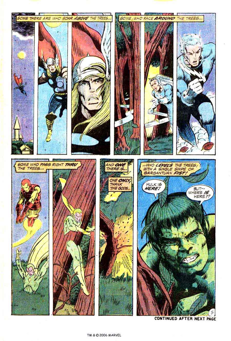
While some of these may need to be tweaked or changed, many of these are the exact features we were trying to capture in a deck of cards that is trying to capture the look of a comic book.  For example, the "Incredible Hug" uses poor grammar just like the green dude that he parodies.  Also, yes, it is VERY busy, kind of like art that jumps all over a comic book page.

Here is a recent response I gave someone else about this deck.  Why we did the deck?  Personally I love semi-transformational decks.  Especially when they follow a theme or topic. It takes a little more to design art that is actually intended for a deck of cards then it does to slap any image on the card faces.  I'm not saying I don't like other artistic decks, but I see the challenge and creativity level it takes to create a deck of cards that has each image that was designed specifically for that particular card.  I have told others that I am a lot different than many of the collectors here, so I do not post much or really even hang out here much.  I am more "old school" and I LOVE trying to bring "new", old school products back to the market.  I don't mind trendy things like 5 million different deck designs that just happen to say "Bicycle" on them, but it isn't really as appealing to me.  It is the art, the design, the originality.

In regards to "thecardcollector", I am guessing this is the same person who sent me a personal message of encouragement from the Kickstarter campaign that said:
"You guys actually thought this deck was a good idea? All I can say is YIKES! As a collector I have no interest, and poker players certainly won't. Don't really see the point to this, but I do see a funding failure, sorry to say.  Victor "
While I can appreciate the fact that he likes to collect playing cards, I also feel there are other types of collectors and card designs that folks like too.  I understand that on the card collectors side there hasn't been a huge following for semi-transformational in the past 20 years or so.  Maybe that is what prompted me to like that particular art even more.

13
Playing Card Plethora / Re: BADASS: Spades & Grenades on KS
« on: January 11, 2014, 04:18:19 PM »
Not to be a d!k but your commenting on the quality of a deck you "think" you received?  LOL ???


ALRIGHTY THEN....
Yep, guess you are trying to be a "d!K"!  I did not say anything about the "quality".  LOL.  What I said was...
"Nice job.  Artwork is very colorful."
I was commenting on the artwork...which I still think is very cool.

Sorry I wasted my time here.  Guess the trolls are everywhere.  The point still is, they did an awesome job.

Yep, ALRIGHTY THEN.

14
Playing Card Plethora / Re: BADASS: Spades & Grenades on KS
« on: January 11, 2014, 02:37:58 PM »
Well, I'm pretty sure I have the deck at the office.  I'll have to check on Monday.  I don't open a lot of the decks when I get them and just add them to my collection.

Don, as for the comments I've made about some of the decks, I guess I see a lot of comments on here and they are often negative so I was trying to give my thoughts.  Especially if I liked the deck.  BTW, I do NOT have them in bulk.  Any of the decks I've bought off Kickstarter so far have been for my collection.

15
Playing Card Plethora / Re: Jackson to do Sherlock Holmes
« on: January 11, 2014, 02:12:23 PM »
Another great deck by Jackson!  He sure likes to add the "stretch" decks to his projects.

16
Playing Card Plethora / Re: Bicycle Global Unrest
« on: January 11, 2014, 01:56:18 PM »
Not a bad concept, but even after looking at it several times it never really made me want to jump on board with the ks campaign.

17
Playing Card Plethora / Re: BADASS: Spades & Grenades on KS
« on: January 11, 2014, 01:54:16 PM »
Got the deck.  Nice job.  Artwork is very colorful.  Great concept and nice addition to any collectors collection.

18
Got this deck and liked the design and layout.  I guess I'm a little different than some of the collectors.  I found the concept unique and fun.  Added a nice twist to a traditional deck.  Then again, while I do cater towards the transformed decks, I also tend to like anything with unique concept card faces.  Nice job!

19
Funded or bought them.  Loved them.  Great flashback.

20
Playing Card Plethora / Re: EclecDeck Transformation Playing Cards (KS)
« on: January 11, 2014, 01:40:34 PM »
Thought about backing this one but it just did not catch my attention.  Love the transformed decks of all styles.

@Emmanuel just went to your site and bought it.  Will be a great addition to my collection.

21
Playing Card Plethora / Re: The Ultimate Zombie Deck (KS)
« on: January 11, 2014, 01:08:01 PM »
I'm glad I backed this one.  I'm not a big zombie fan but the concept was original.  Nice addition to my collection.

22
Playing Card Plethora / Re: Federal 52 Part 2 plus images
« on: January 11, 2014, 01:03:02 PM »
Got mine!  LOVE the artwork.  Great job Jackson.

23
they are cool, but not really usable for anything besides playing dominos. I think USPCC may have to have some blowout sales on these.

This deck may not be for all Bicycle Card fans, but I know a lot of domino fans who have been asking us for something like this for some time now.

Pages: [1]