You are Here:

Show Posts

This section allows you to view all posts made by this member. Note that you can only see posts made in areas you currently have access to.


Messages - mrdude42

Pages: [1]
1
Another update:

2
Finally had some time to make some updates. Thoughts?


3
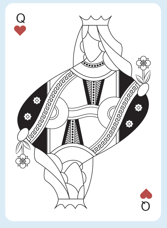
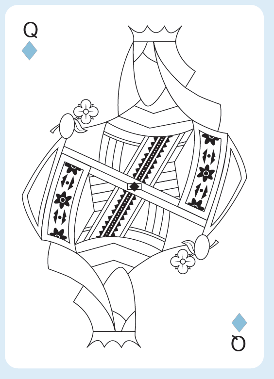
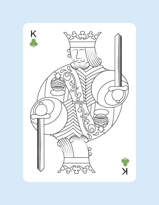
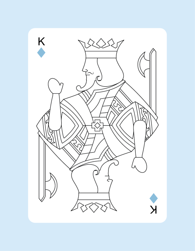
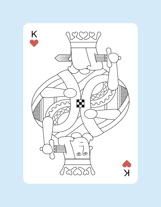
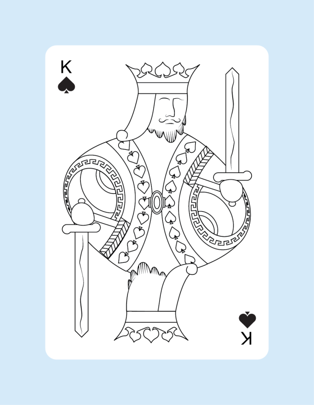
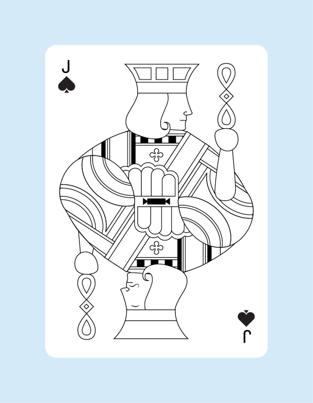
Update with the numbered cards included. Still struggling with choosing the colors. Aces still need a lot of work. Court card faces need color... Also still working on backs. 

(Click thumbnail to see full size version)

4
Here's another attempt. The color of the K,Q,J, and A letters share Red/Black colors while the pips are still 4 colors. I still need to redo the numbered cards with this design but I have the court cards updated so far. Thoughts?


5
My way of pairing the traditionally red and black suits has been to give them something to share design-wise. If you look at the Hearts and Diamonds they both share the same color central banner in yellow while the Spades and Clubs both share a grey-ish colored banner in their centers. Their belt buckles also share similarities 2 being round while the other 2 are square.

I'm hoping I can make the Hearts/Diamonds and Spades/Clubs pairs with enough shared aspects that they will be able to be easily seen has pairs without needing to outright make them just red and black pairs.

I wonder if the Hearts and Diamonds shared a red center banner and the other had a dark grey center if that would work better... Coloring has been quite tough to get right!

6
Hi Don,

Thanks for the reply. You make a lot of great points. I agree that maybe I do need to focus on making these a great poker deck with Tarot inspiration rather than an actual Tarot/Poker combo deck. I might throw in a few bonus major arcana cards in place of the extra cards that come in decks and leave it at that. Using this style I can create a separate Tarot deck in the future but my main goal for this project has been to create a poker deck and the Tarot theme is just what I wanted to use for inspiration and the theme.

As for the 4 color suits. I'm really on the fence about this one. I really like how they look but I understand what you're saying about the audience and that I need to think about what kind of audience I'm trying to make this deck for. Here's super rough mock-up of red/black to see how it could look.

Thanks again for the through response! Also here's an updated picture with some more updates to the court cards:


7
Design & Development / Re: Let us know what you think about our design :D
« on: September 14, 2018, 02:51:42 AM »
Very cool design!

8
Hey all,

I've been working on a deck of cards. Still trying to flesh out the main theme I want to go for but right now its sort of based on Tarot cards. Spades, Clubs, Hearts, and Diamonds are also Swords, Wands, Cups, and Pentagrams respectively like in a tarot deck. There's also 4 colors instead of 2. The idea is for this deck to also be the minor arcana of a tarot deck and later I can design a "major arcana expansion" deck that when combined with this deck would make it into a full tarot deck. The major arcana card in a tarot deck are the ones with names like "The Magician", "The Fool", "Death", "Justice", etc. The minor arcana are the 4 suits with the Ace, 2-10, and the court cards so that would be this deck. Maybe even will include a couple Major arcana as the Joker cards. Like "The Fool" and "Death" cards since most playing card decks have 2 jokers anyways.

I'm also playing around with a duality idea of each of the court cards having slightly different sides. One being normal and the other side being a bit rough or unkempt. This would make them not perfectly symmetrical which would also be good for using them as Tarot cards since a card being upside down means something different than if it is turned right side up. That's one of the reasons I went with the current diamond pip design that isn't symmetrical top to bottom.

Anyways, I'm rambling on now. So what do you think? Any critiques or suggestions on the design?

TL;DR - I'm designing a deck of cards. What do you think?


9
Design & Development / Re: My New Deck
« on: March 13, 2013, 03:11:20 PM »
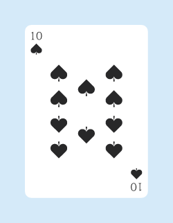
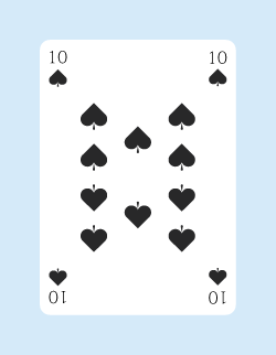
Thanks for the input. That gold color is just one I threw into the backside to see how it looked with color. No colors are finalized yet. The back design is still in progress too. I have another question now though. Which looks better? Pips/Numbers on 2 corners or 4 corners?


10
Design & Development / Re: My New Deck
« on: March 09, 2013, 05:27:01 PM »
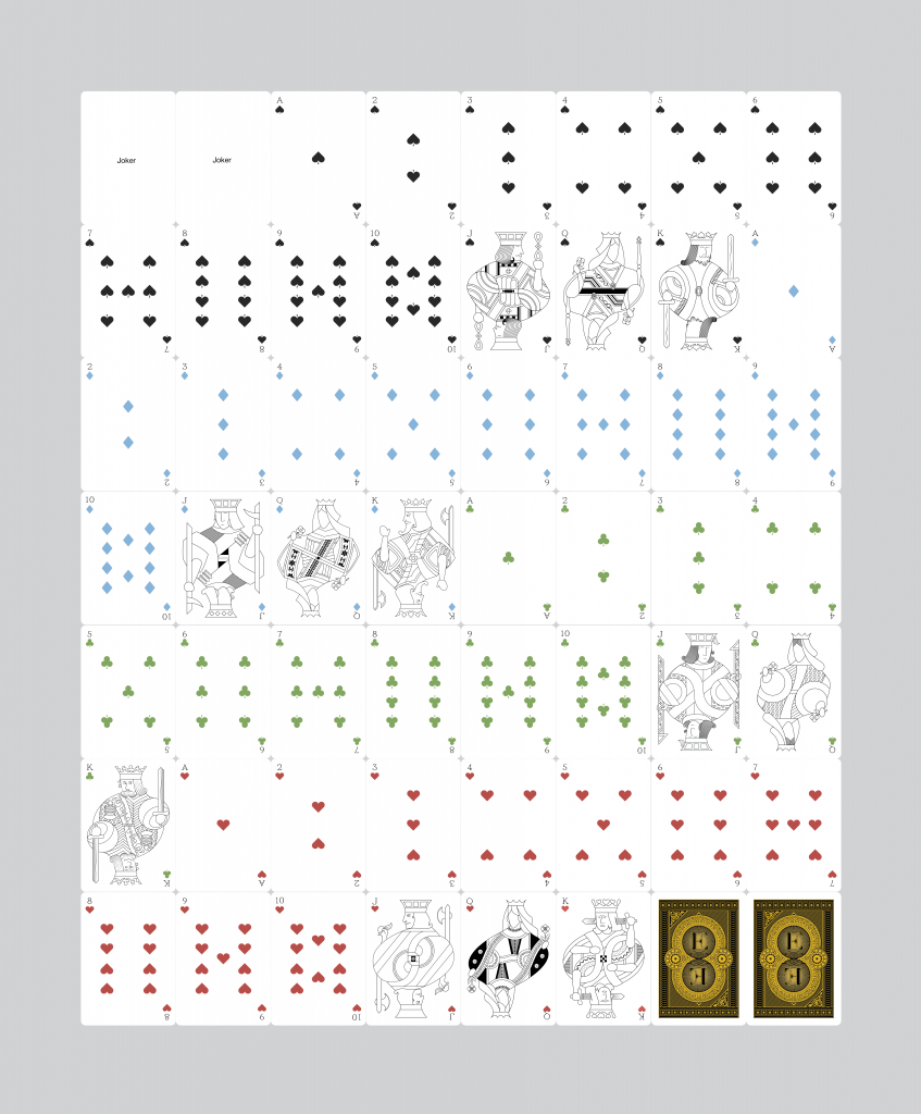
Here's what I got so far for the rest of the cards. What do you guys think? It's probably hard to see so you may wanna download the picture with the dropbox link to be able to zoom in more clearly.

Note these are not complete. Still a work in progress.

https://www.dropbox.com/s/dc3rfnny5cqg372/Sheet%20Deck%20Poster%202.png


11
Design & Development / Re: My New Deck
« on: February 26, 2013, 01:18:58 PM »
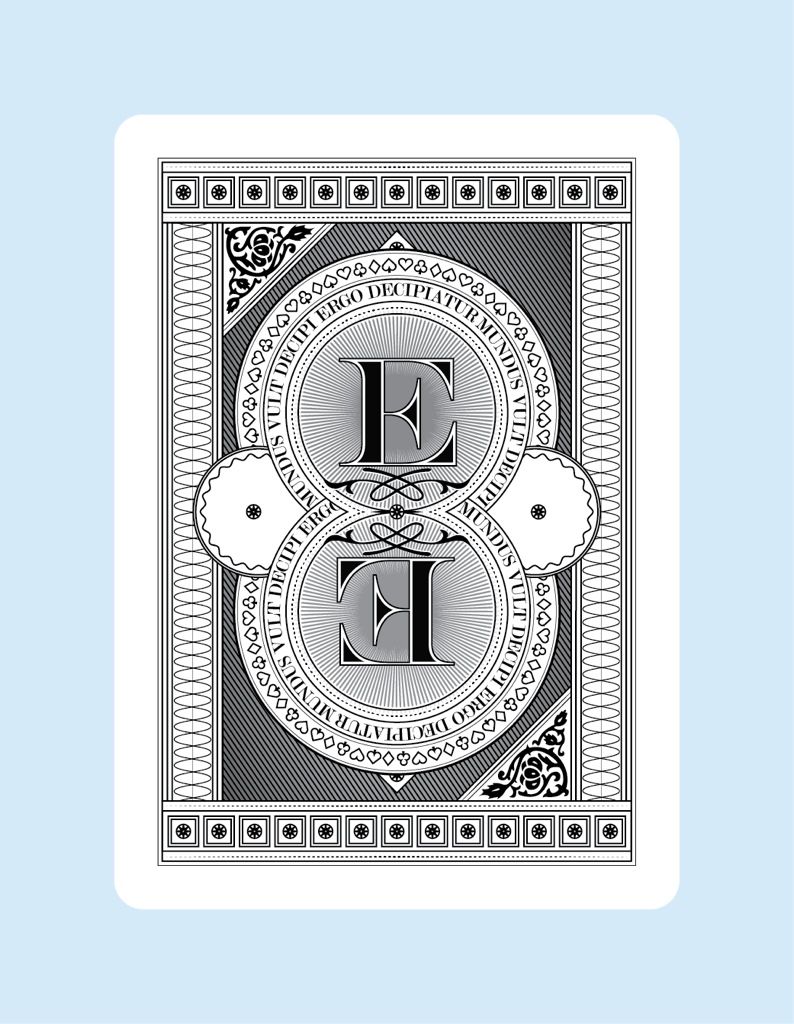
This is not done yet but what do you guys think of the backside I've been working on for this deck? I'm trying to design it so it can be easily turned into a marked deck too.


Here are some more cards too:


12
Design & Development / My New Deck
« on: October 07, 2012, 08:08:31 PM »
I still need to think of a name for this deck but I've been working on it for quite some time now. I think the hardest part is doing the faces and the hands... Does anyone have any feedback on what I've got so far?


13
Introduce Yourself / My deck
« on: October 07, 2012, 07:50:26 PM »
Hi everyone. I found this site from the pedale deck kickstarter comments. That deck looks great and I just donated $15 for one. I thought it'd be a good idea to check this place out since I am too designing a deck. I'm hoping when I post some pictures I can get some good feedback on my designs so far :)

Pages: [1]