You are Here:

Show Posts

This section allows you to view all posts made by this member. Note that you can only see posts made in areas you currently have access to.


Messages - Fess

Pages: [1] 2 3 ... 58
1
Looking forward to it. I'll be in for sure.  ;D

2
They're back and their Blue! :))
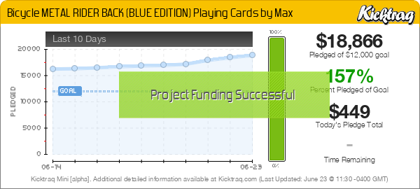
Bicycle METAL RIDER BACK (BLUE EDITION) Playing Cards by Max
By Max (Max Playing Cards) & Collectable Playing Cards


3
I was hoping for an Orange version to show up but I'm in for Red. Synthetic tuck is an instant win. ;)

4
Looks great! As always I'm very happy to support Thirdway Kickstarters.  :)

5
I had no problem backing this campaign. If they are like the V1's and I'm sure they will be they handle great. I prefer them both but I lean a bit toward the yellows too. With the unlock not being achieved I hope they'll have another campaign for them in the future. It was a little odd that they would be a stretch goal in my opinion, seemed like KS was the perfect platform for the Metaluxe to just be on the ballet from the get go.

6
Playing Card Plethora / Re: Marquis Playing Cards - coming soon!
« on: March 17, 2017, 02:16:12 PM »
Love the colors on the card back. I'm excited.  :D

7
Playing Card Plethora / Re: Origins - Shadows of History
« on: March 02, 2017, 12:36:06 AM »
Fun, I like it alot. I'll be there for sure.  :)

8
Cello is a pain. Some of it's better than others but it sucks on most every display. I strongly suggest the It's your collection do what you like approach.  ;)

Quick answer for me personally. I'll buy a deck with no Cello fine, providing the seal is intact and hasn't been pulled. Then it's trickery and I don't care for that kind of nonsense. A broken seal can break a deal for me in a second, depending on the purpose I have for the deck. I fit in the going to use the deck category of collector.

By and large, people who collect tuck boxes tend to like their boxes protected by the cello wrap. I can offer up a deck that has no cello for trade and not get the trade done simply because of that. I don't sell decks so that's really not my dept. I can only use input from my experiences but....

In the end it's Modern Playing Cards we're talking about. Pull the cello if you like, your display will thank you. Just remember keep them clean and be happy. You're not likely to get whatever the ebay high is if you choose to resell them. You'll probably end up at a fair price though. None of them are really going to dent your bottom line if you choose to trade or sell them at some point in the future. If someone wants the deck, they'll make the trade or buy it. It's just that simple. Modern playing cards are modern playing cards.

Word of warning: On some decks with the heavy plastic seals, the cello is what actually keeps the things stuck down.

9
Design & Development / Re: Feedback on custom deck
« on: February 21, 2017, 11:20:18 PM »
This deck looks like a lot of fun. I'm excited for the campaign and I hope,  it's successful funding.  :)

10
Design & Development / Re: Feedback on custom deck
« on: February 17, 2017, 11:57:36 PM »
Looks good, may want to show more images of the cards themselves. Talk a little bit about your design would be bad either, the more people know the more they can connect. There really is a lot going on with your design that is quite interesting looking.

11
Design & Development / Re: Feedback on custom deck
« on: February 17, 2017, 10:40:41 AM »
More eyes on something you want feedback on is always better than less eyes isn't it? We don't always see the same things. You can link it either way you'd like. Here or in msgs I'm happy to have a look at it for you.

12
Design & Development / Re: Best USA fulfillment service for Playing Cards?
« on: February 10, 2017, 07:32:23 PM »
Gamblers Warehouse is the one of the best in the business. They ship quickly and product arrives undamaged. May want to check with them about their fulfillment prices.

13
Playing Card Plethora / Re: Pipmen: World - a real World First!
« on: January 26, 2017, 06:07:51 AM »
A map card sounds like a lot of fun. Looking forward to when this goes live. 

14
Playing Card Plethora / Re: Pipmen: World - a real World First!
« on: January 25, 2017, 02:44:26 AM »
While the deck is being spoiled over at United Cardists (simpler to have only 1 location for this sort of reveal), we are currently about a quarter revealed :)

(Simpler and Lazy since copy past works in both places just fine.)

I don't mind or care where you do what, just pointing that out. You'll get love for your pipmen in both places. Launch it already. ;)

15
Design & Development / Re: Feedback on custom deck
« on: January 22, 2017, 03:43:30 PM »
Jokers are looking good. K and R in the word Joker have a little offset issue. May consider lining the spine of each letter with the outer edge of the O. The O is the anchor letter and the one which will enable other letters to illusion one way or the other. The outer edge should be as straight as possible, again for illusion purposes and because our human eyes like an outer line giving a frame quality.

I like the revamped backgrounds on the courts, however I think I prefer the first version of the revamp on the spades. The negative space there helps point out what's going on. Allowing me to see it easier. Contrast between the added pip and the many colors of your courts with background combined isn't very strong. I'm not seeing the pip easily. This could be helped with resizing of the pip, maybe instead of half the frame width a one third approach. If not a little more contrast could do the trick particularly on the Spade and Club.

Coming to life and I think this is very cool stuff.  :)

16
Tally-ho Circle and Fan backs both sell really well. Even with all my other decks I'm still in for a couple bricks a year myself. Not that I don't care, it's that I didn't think it was even remotely possible for them to suddenly up and stop fan backs.

17
Design & Development / Re: Feedback on custom deck
« on: January 18, 2017, 09:42:20 AM »
Things are looking nice. The changes have been positive in my opinion. I do not believe the cardback is too busy. The negative space is used in a tasteful manner that flows well with your theme. Dimming the green glow behind the title of the deck on your tuck is nice. I also think the enhancement to the hex pattern on the tuck box addresses that very well.

One thing I would like to draw to your attention if the offset illusion of the K on your Kings indices. May want to take some time to center the negative space on the bottom of the letter with the top center of the pip under it. This will help with the feeling of polish. Also any number cards where the font is shifted to one side should have a little extra care.

18
Design & Development / Re: Feedback on custom deck
« on: January 15, 2017, 08:21:52 PM »
Redesigned indices look light years better in terms of functionality. I also like the tails/tentacles you've added in the design. The number cards without the ghosting have a crisp feel that would very likely cause a more positive response than the ghosted number cards would. The full bleed ghosting is light enough that it shouldn't cause an issue with cheatability in the deck, so that's nice. From the 10, Q and K the font you are using for the indices is also nice and clear. I think you are absolutely heading in the right direction these changes have made it a playable deck.

19
Design & Development / Re: Feedback on custom deck
« on: January 14, 2017, 03:21:42 PM »
Theses first critiques are pretty big deals in my opinion. I have to start off with what I say to pretty much everyone who uses wonky pips that people can't easily identify which suit they go to. I recommend you reign it in a bit and try to find a more traditional shape. You can still do tons of sci-fi design in there but the shape is too off with your current pips.

Your QoC shows the indices. That is going to be very difficult to read quickly and easily. I'd suggest moving the indices and making the rank indicator a little more bold. Baring the moving, maybe consider the background instead of a gradient of red to brown consider a gradient of red to transparent so the indices pop.

Your number cards have some complex ghosting in behind the pips. Could consider a simplified image there. When you have a complex image snuck into the negative space, it's not so much negative space any longer and can be an eye distraction. This doesn't effect me to too bad an extent but for some it could be very off putting in the eye feel department. Contrast of the colors between pips and ghosted image is good for the most part, I would still suggest simplifying the ghosted image, removing the box frame on the ghosted image and seeing what it feels/looks like then.

I like the card back quite a bit, great design. Not sure I like all that negative space behind the alien face thing though. It may be a bit too simple in that department, scratch the maybe it is just too much negative space for a card back in today's market.

I like your Tuck box direction. I think it's kind of interesting. The Hex lattice you have is nice. I think it may have more punch if the hex pattern was amped up a bit, maybe colorized. A whole lot of green glowy show on the tuck face is taking the eye away from your alien.

What's going on with the Joker? It looks to me like a bottle cap with gum stuck on it. I do like the transition on the Joker more than the other transitions I see here. It's a more interesting effect than the other joins of the mirror image.

20
My collection is rather large, so in order to show off everything, I took over a bedroom.  It is covered floor to ceiling. See my pics... these are earlier displays, I change it up constantly.

Looks like you're having a ball with your collection!

21
Introduce Yourself / Re: New to the Group!
« on: January 12, 2017, 12:18:48 AM »
Hello Lee, welcome to the forum. Sounds like you've got quite the intense collection going! I look forward to seeing some and seeing your opinions as you join the conversation. You're in very good company here.  ;)

22
Playing Card Plethora / HEROES of the NATIONS (KS)
« on: January 10, 2017, 08:54:42 PM »
HEROES of the NATIONS
By Timothy Kremer


24
Playing Card Plethora / Bicycle NYX Playing Cards (KS)
« on: January 10, 2017, 08:49:25 PM »
Bicycle NYX Playing Cards
By Collectable Playing Cards


Pages: [1] 2 3 ... 58