You are Here:

Show Posts

This section allows you to view all posts made by this member. Note that you can only see posts made in areas you currently have access to.


Messages - Kazerad

Pages: [1]
1
Design & Development / Re: Amphibious fantasy lizardmen - want input
« on: July 21, 2015, 02:20:44 AM »
Kazerad,

Great job on the deck so far! I'm really enjoying the cartoon look and feel (I'd be happy to read your work if you would post a link!). Remember that, although Don is paid for his consultation, it is your deck and you make the final decisions for it. I'm really digging the "Kn" for knight, but a little food for thought: in some Spanish and Italian decks that feature a knight face card, the main way to tell the difference is that they are riding a horse. This could be something you might be able to implement.

I'd really like to see a purposefully one-way back on your cards. Like Don said, maybe use a logo or something that can tie your cards to the comic and will be fan service.

Keep up the great work!
Thanks! And the comic is here if you'd like to check it out.

My apprehension about a one-way back design is that I want to stay true to the deck's in-comic depiction (which, though not particularly detailed, was clearly supposed to look like a two-way design). It's something of a puzzle: trying to make a deck that both looks good and looks like a deck I drew four years ago without knowing I'd actually be producing them one day :). I did polish up the two-way design so that it is pixel-perfectly identical when rotated. I was initially worried that the printing distress might look too obviously fake if it was identical on the other half of the card, but it turns out the duplication is barely noticeable unless you're actively looking for it. And, I figure if someone IS trying to judge whether the back is a one- or two-way design, they are the sort of person who will appreciate that it's one-way even down to the printing distress.
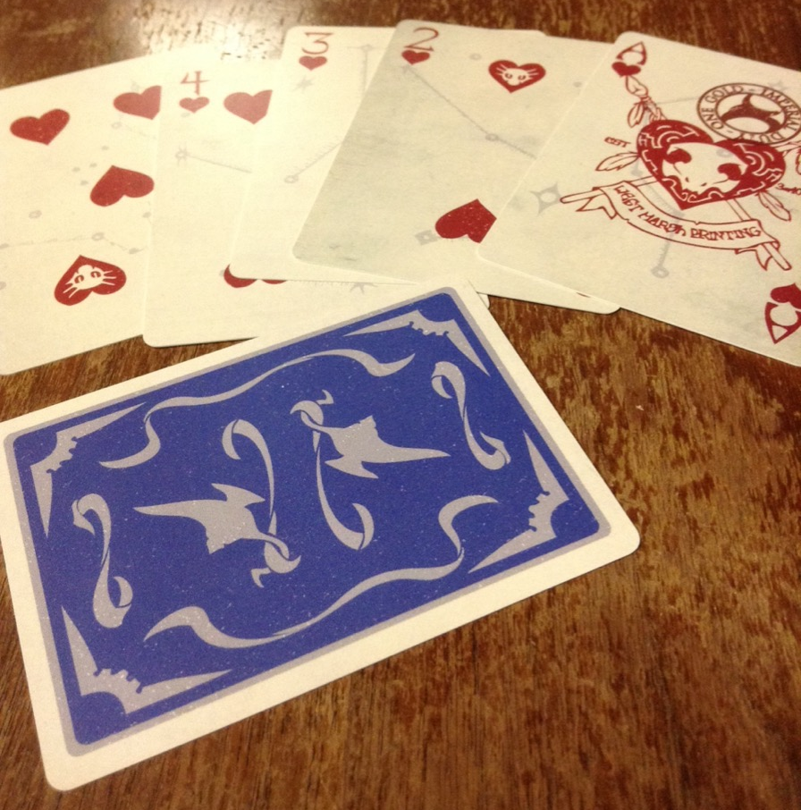


I got a prototype deck printed to check out the durability/colors, and I'm pretty happy with how they're looking. The colors are a little bit more washed out than I was expecting for printing on plastic, but luckily that works with the deck concept. The people who have seen the deck in person so far have liked it a lot; I think these should go over well with the intended audience.

It's worth noting that this deck could be entered in our deck design competition!  Winner gets their deck produced by EPCC and receives 36 dozen decks of their design!

The link to the intro page for the contest is in my signature at the moment.  Check it out, Kazerad!
I'll definitely think about it - thanks for the heads up! I've been pretty busy lately getting T-shirt production lined up, but I'd hate to say no to a contest ;)

2
Design & Development / Re: Amphibious fantasy lizardmen - want input
« on: June 12, 2015, 07:09:00 AM »


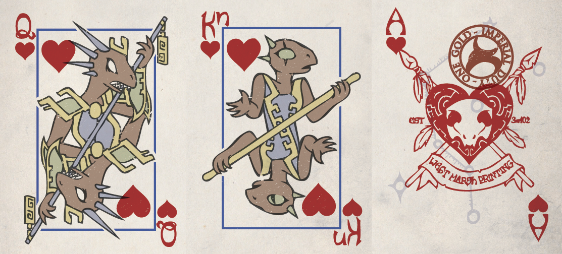
Adding more cards. Though all the characters are in profile, I'm making each of the "one eyed" cards have an eye missing or covered in one of their copies. I stuck the printing company info and a stamp tax on the heart, since it seemed a bit more thematic than spades.

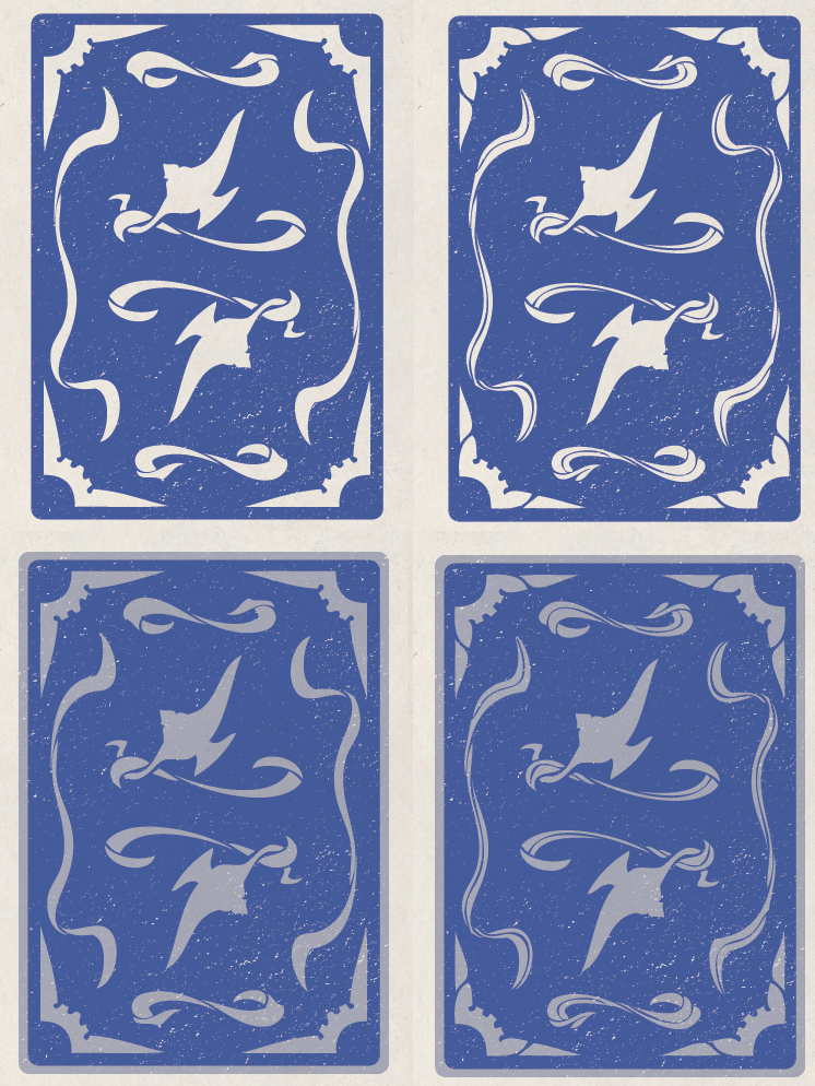
Also working on new, simpler back designs. I think this direction is working out, but I'm on the fence between these four iterations:


They're still not perfectly two-sided, of course, but when I have a design I'm happy with I'll just tweak it into a half-card that can be vertically flipped for the final export.

(edit: should mention that I did get in touch with Boyer about the professional consultation, though sadly Reasonable Rates are slightly outside my budget at the moment)

3
Ack, I didn't even consider that subtle inaccuracies in the one-way design may be construed as worse than blatant ones! Next chance I get I'll simplify the design down to better match the front and, even if I'm not designing a professional poker deck by any stretch of the imagination, make sure the back is vertically rotated with mechanical precision right down to the beige texture appearing the same. Thanks for that :)


4
Thanks for the quick reply, and reassurances on the concept of novelty. I've compared the pricing on plastic decks, and while it's definitely more expensive, most people I've asked seem willing to pay it. If the profit margins look too low after I update my spreadsheets, though, I may change my mind on that.

Knights/Knaves I'm a bit on the fence about, since I know the audience will probably appreciate the old-schoolness of it, yet I can definitely understand why the abbreviation was dropped. I'm hoping that rendering the rendering the Kn differently enough from the K will at least help them from getting confused. I may play it up and go for some other anachronisms too, like stamp duty on one of the cards.

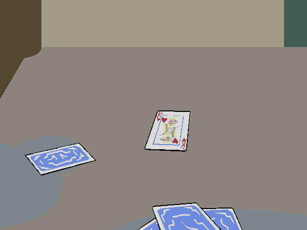
Backs are something I'm a bit less certain about. When they appear in the comic, they're pretty simple, but I might want to write that off as an artifact of the simple rendering style:


I just finished giving a shot to a more complex design that keeps the same basic shapes and contours, not yet sure if I like the complexity or feel that it doesn't match the face well enough.


5
Design & Development / Amphibious fantasy lizardmen - want input
« on: May 28, 2015, 08:20:43 AM »
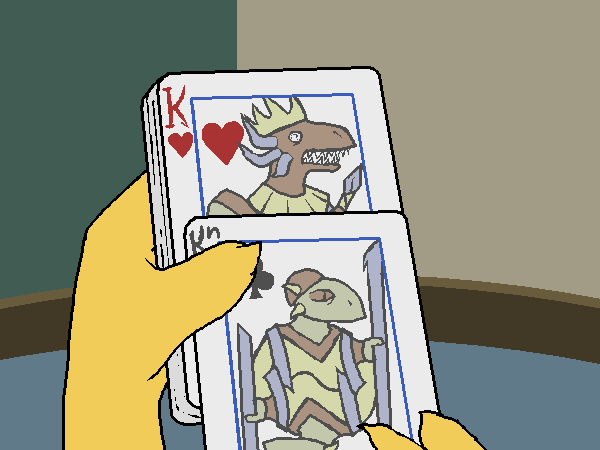
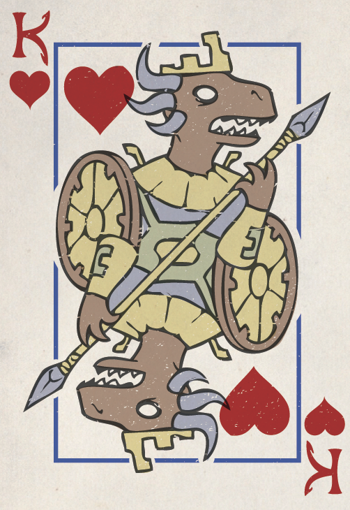
I write a relatively popular well-known comic parodying the Elder Scrolls series of video games. Recently I've had a lot of readers demanding that I produce merchandise, so I've been looking into what sort of things I could make without violating any Elder Scrolls copyrights. One idea I've been considering is a complete set of lizardmen playing cards based off a deck that briefly appears in the story:


So far, the response from fans on the idea has been overwhelmingly positive, but they're mainly looking at it as merchandise for a comic they enjoy. Ideally, I want to make these also work alright as actual playing cards, and ensure that I'm not making any obvious design flaws that would consign the deck to being pure novelty.

My current prototype for a "full-size" design is this:


My goal is to give them a sort of "fantasy-level tech" appearance as though each color was stamped on with a plate. I'm currently planning to print them on plastic via MPC, since when the cards appear in the comic the main character specifically notes that "they're waterproof. Which makes sense, for a race of amphibious lizardmen". The biggest things I feel unsure about at this point are whether the imperfections in the "stamp" look alright and if the pips are decently readable at a glance, though I fear there may be other obvious things I'm overlooking as well (a thread here regarding some black cards, for example, noted that ink can chip around the edges with time. I'm hoping my background color is light enough or MPC's plastic is sturdy enough for that not to matter).

Anyway, any input is appreciated! My primary concern, of course, is making something that will appeal to my readerbase, but if at all possible I want to make sure I don't produce something that is sub-par as an actual deck.

Pages: [1]