You are Here:

Show Posts

This section allows you to view all posts made by this member. Note that you can only see posts made in areas you currently have access to.


Messages - GBAllison

Pages: [1] 2 3 ... 5
1
Playing Card Plethora / Re: Bicycle No.17 by Stockholm 17 (KS 02/17/2015)
« on: February 17, 2015, 07:21:39 PM »
Wow ... looks like it's gonna fund in 24 hours.
Only a few designers play in this lofty territory, and this guy completely deserves it.
Win-win.

2
Playing Card Plethora / Re: New NOUVEAU Bicycle deck
« on: November 23, 2014, 08:10:23 AM »
New back, opinions please!  :)
I can certainly see how much work went into this.  But for my tastes, it doesn't read Art Nouveau.  It reads geometric, now in a more stained-glass style.

I started to write a reply that talked about the stylized organic forms of Art Nouveau, building (occasionally) off of a single background circle, with offshoots of hyperbolas and parabolas, and the distinctive whiplash ... but then I realized you fully understand Art Nouveau--your courts have captured that magic wonderfully.

My problem is that the fronts and the backs just don't go together--they come across as very different styles.

3
Playing Card Plethora / Re: New NOUVEAU Bicycle deck
« on: November 05, 2014, 07:43:54 AM »
The fronts are beautiful and really deliver that art nouveau look and feel.  But to me, the backs are completely disconnected from the organic and flowing style of art nouveau.  True, they're intricate.  But the look is all perfect circles and geometrics--almost the antithesis of art nouveau.  For me, that's a showstopper.

P.S. Agree completely that the indices need to be closer to the edge--where they are now makes a bridge hand almost impossible to hold.  I don't mind the plus-sized white space on the number cards--I love a pip layout that's a bit unusual, while staying legible.  Like others, I do mind the lack of a large suit indicator on the court cards.  You need to be able to tell at a glance what card is being played--and in many games the suit counts.

All of those are easily fixable ... but the backs ... oh man.

.

4
Playing Card Plethora / Re: Patriot Playing Cards KS
« on: November 03, 2014, 12:32:22 PM »
Taken down and re-launched

https://www.kickstarter.com/projects/1091497456/patriot-playing-cards-0

The new design puts the courts inside of frames.  But Franklin Roosevelt is still pictured as Teddy.  Lincoln is still drawn with an eraser.  And I'm still not pledging.

The designer *does* tell a story about how he, a Canadian, came to design a deck intended to focus on American history.

5
Playing Card Plethora / Re: PAVIA Playing Cards (KS)
« on: October 23, 2014, 11:16:15 AM »
With those indices, the deck is unplayable.

I don't mind the one-way, I like the photographs (which clearly have a theme), and even the photoshopped backs appeal to me.  But from that point on, the deck spirals horribly.  And then comes the alternate-color deck.  For my folks, the jump from white to black is just too jarring.

Some really nice ideas hidden underneath the disconnected font bling.  Complete pass.

6
Playing Card Plethora / Re: Shannon Young's Derby Deck (KS)
« on: June 24, 2014, 07:47:20 AM »
P.S. Agree with Don completely that the court conventions (one-eyed, etc) and court themes are anything but mandatory.  But what's supremely frustrating to me is when the collection *does* include one-eyed characters, and then because the deck designer isn't thinking (or doesn't know), decides to put the one-eyed character in the wrong place.  If you have a suicide king candidate, make it the king of hearts not the queen of spades.

Similarly, if the illustrations *can* be grouped into themes that would make it easier to tell apart the kings from queens, then they should do that, instead of using Random as the design approach.

I will say that I've often thought about this telling-apart-the-court-values issue with pure-art card decks. It seems to me that it would be pretty easy to modify the *border* treatment, around the art, so that all the kings have one type of border, all the queens have a different border, etc.

Of course if the kings' border was full bleed (oops, full circle :-)

7
As I see it, it's pretty simple.
[...]
As far as needing USPC permission to claim a project will be printed with them, well - I've seen countless projects make that statement.  Without a signed contract in place, it's a little harder for them to dictate such terms.  After all, we say "deck designer", they say "potential customer", so they're not going to push too hard on the subject, unless the designer has no intent of printing with them at all.  USPC will help with a little bit of the planning work needed before a KS launch in terms of supplying best practices documents and templates and such, but as was previously stated, they don't begin actually vetting a project until a contract is signed and funding is in place.  It's not impossible that they'd reject a project for certain reasons, but I've never seen them go that far - the closest would be a non-KS project, the Karnival Inferno deck; the company forced a redesign of the artwork to remove some of what they perceived as the more "Satanic" elements and the Bicycle brand name was removed.

The Alice of Wonderland Play Cards Deck was given an ultimatum by USPCC ... either change the project "to eliminate every Wonderland element (no Hatter, no White Rabbit, no Alice of Wonderland title, no Cheshire Cat, etc)," or pound sand.  According to the project creator, "I could not foresee the original printer changing their minds late in the project."  Cartamundi looked at the same project and the same copyright issues and arrived at a different answer.  The project switched to Cartamundi.  (Sadly, the project then ran afoul of money/shipping issues and deliveries are supremely delayed--but that's a rant for another day. :-)

https://www.kickstarter.com/projects/jsolorzanoarts/alice-of-wonderland-playing-cards-printed-by-uspcc

It *is* pretty simple.  If you can't find a printer who will print your cards, then your project is dead in its tracks.

BTW, I'm not saying that the printer is the judge and jury--they don't have the *final* say on whether you will get sued into submission by Disney's Army Men of lawyers.  Or whether you would ever win in a court of law if you *did* decide to play How Big Is Your Budget For Lawyers? with someone like Disney.  But the printers are an absolute hurdle.  If you can't convince them, then your project is done-zo.

Yes, done-zo is a legal term.  Look it up.

:-)

P.S. This is about the digression topic, not about Nat's card deck.  Knowing him, I'm guessing he's done the homework and has at least lots of his non-infringing non-Disney ducks lined up already.

8
Playing Card Plethora / Re: Shannon Young's Derby Deck (KS)
« on: June 23, 2014, 08:11:01 AM »
First off: I am a HUGE fan of the concept, and the artwork. I have family in derby (either that, or I am derby family :-) and I wish this deck would fund.  Sadly, the first-time-into-playing-cards really shows.  Don gave you a bunch of expert advice.  Lots.  Mine is a shorter list.
  • Can't do full bleed. Just can't.
  • PLEEZE move the indices closer to the edge so that I can hold them, fan them, and use them as playing cards.
  • Ideally, you could make those indices smaller, but if you're sold on JUMBO index, at least move them closer to the edge
  • Isn't there some theme in these illustrations that would make it obvious when you play a king that it's a king, and that the queens have a common theme, and the jacks are identifiable? Could they maybe be on the same team?  Something.
  • Having two decks with contrasting backs is a HUGE benefit.  To me that's much more important than two-way backs.  But in this case, a bad-ass deck and a sweetheart deck, both two way, tells the story and sells the mdse.
  • Bicycle brand is a big winner as well.
  • Are any of her illustrations one-eyed? Or could be read as suicidal? You might want to lay them out as the correct one-eyed cards, and the suicide king.
  • Love the pip layout!
  • Don't love the index font.

9
Playing Card Plethora / Re: Demon Deck Playing Cards (KS)
« on: June 22, 2014, 07:57:39 AM »
It's ba-ack.
https://www.kickstarter.com/projects/891191024/demon-deck-limited-edition-playing-cards

Same bad grammar, same deck.  He calls it a relaunch, but then he says "This project is relaunch of our previous project just to let backers to grab some add-ons that they missed and to get some new backers."

Funding goal is $100. 7 days. Not a typo. Estimated delivery is still August.

Pledge levels are confusing:
  • Pledge $1 or more - ADD-ONS. This revard is for add-ons. Type ammount of add-ons that you selected. Worldwide shipping is included
  • Pledge $11 or more - FOR NEW BACKERS. 1x Standard Edition "Demon Deck" playing cards deck. Add $11/14 for each additional S.E./L.E. deck. International buyers please add $2 for shipping
  • Pledge $11 or more - FOR PREVIOUS PROJECT BACKERS. 1x Standard Edition "Demon Deck" playing cards deck. Add $11/14 for each additional S.E./L.E. deck. Worldwide shipping is included
  • Pledge $14 or more - FOR ALL BACKERS. 1x Limited Edition "Demon Deck" playing cards deck. Add $14/11 for each additional L.E./S.E. deck. Worldwide shipping is included
Here is the rest of the Risks section.  Looks like he was writing directly to Don:
  • All possible risks were taken highly serious. Everything - from technical moments and design, to production time and shipping - checked twice. Production and shipping costs are precisely calculated and included in the project goal.
  • Drawing of special hand-inked deck can take some more time, so you may receive your deck a bit later, but we'll do our best to get your deck on time.
  • We guarantee, that these playing cards will be factory-printed with highest quality and shipped to you on time.

10
Playing Card Plethora / Re: Lost Wax Playing Cards (KS)
« on: June 19, 2014, 02:05:48 PM »
As far as I can tell, there's no good reason for such a goal - the deck appears to have been made already.  It was featured all over the place in September and October, mostly by the artist.  They aren't expensive, nor are they diamond encrusted.  He's added rewards for buying by the brick, but the deck is the only thing selling - he's giving away the only other reward, a tote bag, with the decks.

The math, however, is hairy bat-guano crazy...

I don't mean to be mean.

But how is this Nigerian art deck different from the eight-zillion Nigerian email scams we've all received employing bad grammar and hairy bat-guano crazy story lines to try to get you to email them your money, name, address and other personal information?  Answer:  Well, it's on Kickstarter.  Which has never had anyone come in and try to scam the playing card community.  Where every project creator, ever, has been 100% honest and trustworthy.  And where red flags always turn out to be innocent coincidences.  ... Oh wait.

If there was EVER a project that screamed SCAM from every pore, this would be it.  The fact that the ridiculously high goal makes it almost impossible for the scam to work does not turn down the volume on the screaming.

I love the font.  And the artwork is OK.  I would pay several dollars for a deck.  Definitely more than 3.  Maybe even more than 4.  But not to someone carrying so many red flags.

Yikes.

11
Playing Card Plethora / Re: Plugged Nickel Playing cards (KS)
« on: February 25, 2014, 08:53:54 PM »
+1 on Don's suggestions about design elements.  Better cards are designed that way not because we like doilies and Downton Abbey, but because we want to actually *play* with the cards, or flourish them, or work with them in some way that *our* friends (or audiences) expect playing cards to work.  If you fan the cards, you should be able to see the suits and indices.  If you put a card on the table, you should be able to figure out what it is without having to pick it up and look at it.  (Not that your deck fails in that regard ... I'm flying on the wings of this tangent for a moment.)

OK, backing away from the tangent ... I'm OK with barbed wire (although I know others aren't).  *My* problem with the subject matter was yet another foray into skulls and the undead.  So I get the twist that makes it unique, in a Cowboys and Aliens kind of makes you laugh at the movie title way.  But I'm tired of it, not feeling it.

Downton Abbey???  Really?  Ouch.

I have my share of fantasy-based cards in my collection, and even what I would think of as punk.  The obligatory pirates, scifi, Jacksons, hippies and steampunks to go WITH the florals and art deco.  But the one theme that runs through 'em all is beautiful deisgnwork.  Which brings me to ...

Frazetta!?? You bring up Frazetta to trash Downton Abbey?  Frank Frazetta's uber-classic techniques were the stuff of legend, infusing the sweeps and arcs of art deco and Downton's flapper era with the subject matter of fantasy and science fiction. Oh man, I'm off on a tangent again, recalling the classic works of Roy Krenkel and J. Allen St. John.  Done with the same style and grace as Maxfield Parrish and N.C. Wyeth.  Later carried on by folks like Jeffrey Jones.

I have a deck with a Maxfield Parrish back, and even though it's all standard faces on the inside, it's one of my favorite decks.  I would *love* a deck designed with the same sense of balance and wonder that Frazetta (and Krenkel and Jones) brought to every comic and book illustration.  Wow.

Even when you update the subject matter, the work of great artists shines through.  While the classic sci-fi authors were being interpreted in the 40s and 50s by the folks I'm mooning over right now, today's graphic novels represent yet another gorgeous art form for today's reboot of hardboiled film noir storylands.  Frank Miller, Bernie Wrightson and dare I say it, Judge Dredd's own Carlos Ezquerra ... the list spans the imagination.  Inspiring in the truest sense of the word--you find yourself compelled to join them in the places they create.  All.  Gorgeous.

But I digress.

12
Playing Card Plethora / Re: The Flight Deck
« on: February 24, 2014, 07:28:10 PM »
I'm in.  These are GORGEOUS.  What an elegant art deco look to the whole thing.  And while I get it that your skull is a signature thing (and not in keeping with the art deco theme at all), THANK YOU for not putting a skull on every card.  One on the Ace of Spades?  That's cool ... your signatures, your rules.

A question ... if we're supposed to recognize who the people are on the courts, it would be really nice if one of the extra cards would have a cheat sheet to tell us who's who.

This is a must buy for me.

Well done.

13
My oh my...these are quite lovely.

I'm not a big fan of the faces of the court cards, however...the Jack, Queen, and King look too tired.
I *love* the long flap.  But you're right, every court looks terribly, terribly sad.  And that poor one-eyed Jack.  I feel his pain.

:-)

14
Playing Card Plethora / Re: Edinburgh Playing Cards - (KS)
« on: February 05, 2014, 04:17:37 PM »
I love Don's point about conveying pride with your photographs.  Imagine that all the clubs are a walking tour through Old Town, All the diamonds are from New Town, and all the hearts from West End.  Spades would be from the surrounding area.  Your locals will get it, big time, and your repeat tourists will know what you're talking about too.

And the photos themselves--instead of the standard picture postcard view of Old College, use a picture of when it's all lit up, at dusk.  Or get something *really* close up.  Something that all the locals know, something that they would all say WOW about.  Instead of the postcard view of St Giles' Cathedral ... crop a close-up.  I love the amazing glasswork above the front entrance. I know the spire is iconic, but maybe that's a little too "normal."  You'd want to be looking for the *special* photograph that sings to locals and tourists.

Don hit the nail on the head ... show the pride.

Your customers already have the pride.  To make this a must-have, your photos will capture that pride.

15
Playing Card Plethora / Re: Edinburgh Playing Cards - (KS)
« on: February 03, 2014, 11:37:26 AM »
Our neighbors buy tourist cards on every trip they take.  So we play with them a LOT.  Photos without captions are almost meaningless.  One or two-word titles help some, but the more fun decks are the ones that add an extra sentence about what's pictured on the card. Especially if it teaches you something new. The better decks actually apply some sort of theme--with the Aces being photos of the most important features at the destination, and then the Kings, Queens and Jacks also related in some way.  Our favorite decks have 52 images.  It's annoying when we discover that all the fives have the same image.  Or worse, that all the clubs have the same image.

My favorite ever destination deck is a Canada-themed deck that I played with once at someone else's house and have never seen since.  Each card-value represented a specific location (I remember that the Aces were all Canada, and the 5s were all Manitoba), and then each suit offered something different about the locations.  For example all the clubs had the location's flag or seal.  All the hearts had a map of the location.  All the spades showed where the location was on a big map of Canada.

That said, I was an automatic pass on the Edinburgh deck.  I don't collect those ... but even for my neighbor ... no titles, no captions, no education, no themes.  The fonts were overdone and the backs were underdone.  I expect a destination deck to have a one-way back, but I would hope for it to *say* the location.  Literally.  It should have the word Edinburgh on it, it a nicely done font.  And maybe with a map or other clean, bright eye-catchy logo.

Just some suggestions.  Hope this helps!


16
Playing Card Plethora / Re: My One Year Anniversary Giveaway
« on: January 22, 2014, 08:35:13 PM »
So far: most popular is diamonds; clubs are least favorite, the majors are practically tied.
Only one each of 10s and kings.
Semi-interestingly, 4 people chose Jacks, but not one of each suit.  Same with the 2s.
Only one of the one-eyed Jacks is chosen.  The one-eyed king is taken (KoD, Man With An Axe). But look!
The suicide king hasn't been chosen yet, and since 'random' gives an equal chance to every card--famous or obscure ...

I'm guessing the King of Hearts.

17
Kudos for the one-eyed jacks, the one-eyed king and the suicide king.  I love that nod to the classic courts and cardistry.  Of course, the king of diamonds looks more like the suicide king than the actual suicide king, and he certainly could have had an axe and fit in with this theme, but now I'm just nitpicking.

Still, this is a big pass for me. Cowboy skulls not singing to me.

18
Early bird dice are up for a $1 pledge.  Only 8 left.

BTW, I'm curious about why this deck isn't racing off the shelves, so to speak.  Do you think there was too much attention on the goggles?  Or a bit too much confusion on the pledge levels?  Or is it something fundamental about the art?

Sure I get it that there have been a million steampunk decks already, but that doesn't seem like the showstopper.  We seem to be able to do zombies and more zombies.  Maybe the deck didn't get covered by a couple of the main bloggers?  Maybe not enough pictures of the cards themselves?  Just really curious.

19
Playing Card Plethora / Re: VJose32 Playing Cards (Etsy)...Wait, (Etsy)??
« on: December 17, 2013, 10:38:29 AM »
First of all, I didn't design the cards, Ade did, and everyone in my group was in favor of the decks and the art was voted on by them. As Ade mentioned he also won a design contest with Club 808.

Hey guys, I'm the designer of the deck  :)
It's actually a design contest from his facebook group, winner getting the deck to be printed. I won the contest and Victor printed the deck. From what I knew, he only print it in a small quantity, and ended with a such prize.

So I realize that talking about the deck itself is probably off-topic by now :-) ... but where *did* you get the courts artwork for this deck?  They look exactly like (not just sort of like) the Bicycle Voyager.

I will say that I was disappointed in some of those courts ... no suicide king, not enough one eyed jacks, adding a one eyed queen, no axe for the KoD ... I love the alternate design, especially with a clean white background and the nicked up pips, but when you build something that has that classic feel ... ah well.

And finally, this is obviously a short run ... where were they printed?

Thanks!


20
[...] The body of the project is a little deceiving. No where does it say paper cards except one quick blurb about "3 finishes Copper, Stainless Steel, and Paper with a magic finish", and on the pledge levels.

Actually, I thought he did a great job in the pledge levels. Each and every one is very explicit about what you're getting ... paper or metal.  (Other project creators have not been so clear, and they waste their first 50 comments trying to explain what the pledges are :-)

But I agree that the tuck boxes are misleading ... they make it look like there's metal inside when there really isn't.  Also, there's not a lot of info on what the paper cards will look like.  (Well unless those pictures *are* of the paper cards and there are no pix of the metal cards :-)

P.S. I loved the suggestion of one commenter--to offer a random card in (backer's choice of) real metal.  I'd be intrigued about buying one card, but gotta buy a whole deck, at that price?  It's a novelty pass for me too.  (I need my budget for Virts 2 :-)

21
Playing Card Plethora / Re: Bicycle Emperor Playing Cards (KS)
« on: December 16, 2013, 07:55:30 AM »
These decks turned out amazing.  The artwork on the courts is first rate--classic playing-card design work, with a beautiful theme, executed flawlessly.

I remember that when this project first started, there were red flags all over the place.  I still wish the project creators had been a bit more transparent about what they were doing, but the fact is that this time the project turned out well.  Great product and early deliveries.

Sometimes you roll the dice and you get Founders.  Or ... everything comes up Emperors.  I hope these people do more.

22
Playing Card Plethora / Re: Founders Playing Cards (KS)
« on: December 14, 2013, 10:13:53 AM »
So I found this to be interesting.  Apparently the guy is "updating" his Facebook page by routinely deleting any negative comments.

https://www.facebook.com/FoundersPlayingCards

Quote
corey on Dec 3

scumbag keeps deleting my comments on the founders facebook.

most recent comment was something along the lines of "just wondering how you find the time to delete all my comments but don't have the time to say sorry for this failure of a project and refund everyone immediately".

deleted within a few hours.

I assume people know about how to report his Facebook page as "spam or scam."  If enough people do that, at least Facebook might pull down that page.

23
Playing Card Plethora / Re: Bicycle Seven Seas - Coming Soon
« on: December 13, 2013, 03:03:21 PM »
Yet another vote for "TWO WAY I."  The suit icons are a particular pet peeve.  Unless I do a lot of tarot card readings, I don't really need those indicators to remind me that this is a deck of playing cards.


24
+1 with Don on the consistency point.  Either use the frames or don't.

I see how going full-width has a Wow effect.  The problem is that you'd have to re-work a bunch of your artwork.  The King of Spades for example, would have to lose his reading lamp.  And not sure at all what you'd have to do to the woman's elbow for the Jack of Hearts.  Seems like a lot of work and honestly, the frames work great.  Especially when a characters bursts out beyond the borders.  Adds real pop to the look.  Love 'em both but ... either way, choose it and stick with it.

At least within a particular deck :-) 

(Wouldn't *that* be cool?  A standard framed deck and then the CLOSE-UP deck.  Now *that's* a limited edition :-)  (Nah ... too much work.  But still :-)

25
Playing Card Plethora / Re: Meeple Playing Cards
« on: December 13, 2013, 02:23:23 PM »
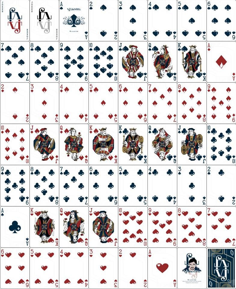
I'm curious what other folks think about 4-color decks.

Four-color decks are an automatic pass for me.  Count me in the hate-em group.

I don't mind the one-way backs, and very much prefer the one-way courts.  They fit the theme.

Love the alternate-color decks.

And love, absolutely LOVE the Suicide King. :-)  I'm hoping there are other surprises as well (one-eyed dots for the J of spades, J of hearts, and the K of diamonds?  And maybe an axe of some kind for the K of diamonds Man With An Axe?  Gives the poker players a handle for some of the more popular wild-card conventions.)

I expect this deck to be used to play games (by most purchasers), it needs to be uncluttered and easy to read at a glance. It has to fan well, stack well in solitaire games, and be easy to recognize across the table for games like Hold ‘Em poker.

I think you hit the nail on the head: The deck should be playable.  Uncluttered.  Easy to read at a glance.  Agree that you don't need different crowns for different suits.  The changes you made to the Queen are great. I recognize her immediately.  And the more-pointy crown on the King helps, too.  Still, the Jack ... maybe the Jack could have an upraised arm (or two?  Nah, one is enough :-).


Pages: [1] 2 3 ... 5