You are Here:
Seeking feedback for my minimalistic deck of (extended) playing cards

Author (Read 14831 times)


selfthinker

  • Newcomer
  • *
  • 8
    Posts
  • Reputation: 0
I have recently designed my own deck of playing cards.
I’m not a designer but I always loved playing cards. My interest in them is mostly from the playing aspect, I love the idea of a game system and the versatility of them. And I love unusual designs. I don’t own many decks (less than 10) but love looking at interesting designs online.

I got into designing this set for three reasons: a) I had recently discovered game-icons.net, b) I designed my own version of Love Letter first which gave the direction of this specific style and c) I wanted more than 4 suits.
I’ve only designed them for myself, but I’d be happy to open the designs up on MakePlayingCards’s marketplace if anyone is interested. (I printed mine via MPC.) This is not a commerical project, just a fun hobby project.

I’ll explain some of my design choices. I have already found a couple of flaws which I have fixed in a new version. But before I’m going to print those, I’d love to get some feedback. I’ll show my improved version at the end.
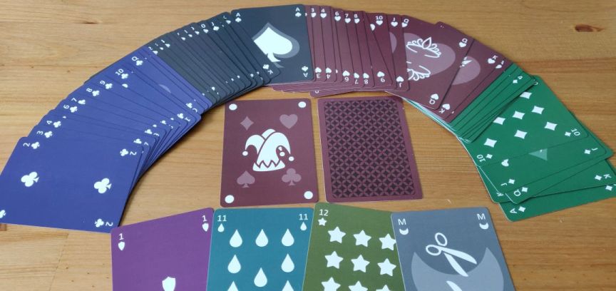


General design

I like dark backgrounds and minimalistic, simplistic, flat, abstract designs. After making my own Love Letter version recently, making playing cards in a similar style was the natural next step.

When I had the physical cards in my hands, I noticed that because every suit has its own background colour, you can sort of tell the suit from looking at the cards from the side in some situations. I wonder how much of a problem that would be in practice?

I tried to fix that by adding a same-coloured border to the front of the cards. But whatever I did, it never looked right. I think I’ll just live with that design flaw, unless I find something that works and looks good.
Instead I also designed a version with a light background. Cards from that will definitely not reveal their suit.

I’ve intentionally not mirrored the pips at first. I didn’t see the point because it only works well with even numbers. But when I had the physical cards in my hand, I found it more annoying than I anticipated, so the improved version does mirror the pips.
I’ve also intentionally made the distribution of the pips different to classic cards. That was mainly because it was easier to do this way.

The indices are in all four corners to make it possible to fan them in either direction.

I found the indices on the first version are a bit too small and I wasn’t happy with the font either. Both have been improved in the improved version. (It was actually quite difficult to find a good font for indices, that’s the main reason why it didn’t have a good one in the first version.)
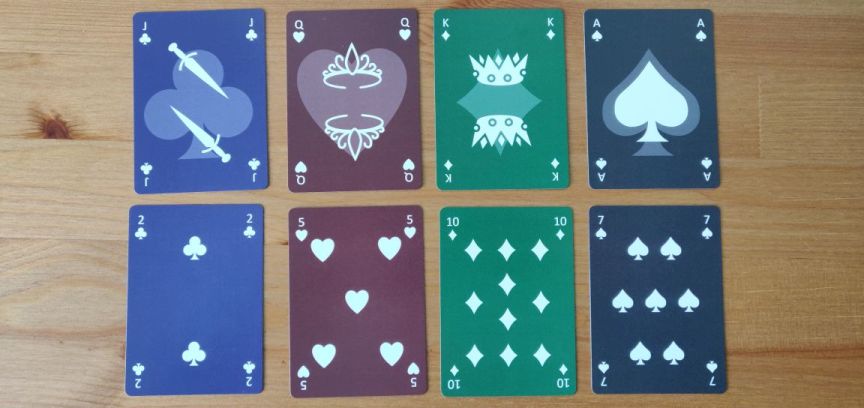


Suits

I originally only wanted one more suit (to be able to play Lost Cities), but then got into searching for good alternative suits and found four more suits which made sense and worked well.
I’ve looked a lot at other alternative suits, either from historic or modern decks. But I was really disappointed with most of them. They rarely fit the genius simple design of the French suits (diamonds, hearts, spades, clubs). One of the reasons why the French deck became so popular is because the suits are so simple that it’s easy to create stamps which made them easier and cheaper to produce.
Simplicity made them successful, so, whichever additional suits I would pick, they’d have to be as simplistic. And something else I noticed: They all have at least one curve and one spike and are vertically symmetric. (Diamonds don’t always have curves, but some variants have, like the one I used here.) I tried to find suits which would meet those criteria.

So, I chose: shields, drops, stars, moons.

The stars don’t have curves either, but they could have. The reason why I had to have stars is because that is the one constant alternative suit that appears everywhere. And it pairs well with moons. It makes sense and was the first one I’ve chosen.

I always liked the thought of four-colour decks. I’ve never owned one but have read about them. Naturally, I wanted my deck to have four coloured suits as well. They make it easier to distinguish the different suits, although in some card games they will make pairing more difficult because there are no two red suits and two black suits anymore.

I intended to use the most common four colours but somehow got the diamonds and clubs colours mixed up. I fixed that in the improved version.
The other colours fit the theme of the other suits: Shields is purple is royal, drops is teal is watery, stars is yellow(ish) is shiny and moons is grey is nighty.
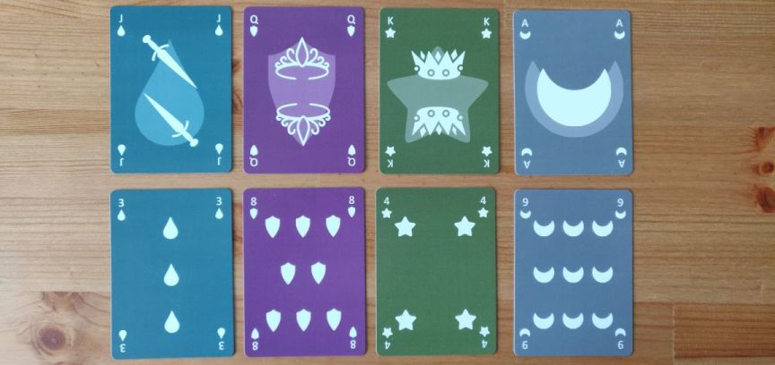


Ranks

The face cards are quite minimalistic. I didn’t want to have any unnecessary elements. I chose to add the transparent suit to the background rather than a single solid suit to the side to make it more symmetric and less in the way of the simplistic design.
I love designs which somehow merge the face and the suit. But I don’t have enough design skills to pull something like that off.

I played around with mirroring the background as well. It would make more sense but then it was more difficult to see the main image in some cases.

I originally only wanted one more rank as that already existed (historically and in a Tarot deck). But when I had to print amounts of cards that were dividable by 18 (or I would have to pay for blank cards), I also added 1 (which is used in some other decks and makes it possible to use 1 and Ace differently), 11 and 12 (which fills the suit grid nicely and makes some historic sense, thinking of the duodecimal system).

But the main additional rank is the Maid.
A Tarot deck has the Knight as a fourth face card but I wanted something female. Other decks have a Princess but I didn’t find that fitting as there is no equivalent Prince. It does make sense to find a female equivalent to the Jack, as the Queen is the female equivalent to the King.
(Also, I like how “Jack Maid” sounds like “Check Mate”. ;-))

I’d like to add 2 more face cards, though. It would be good to be able to go back to the original three clear ranks (Knave, Knight, King). I have one high rank pair and one low rank pair. It makes sense to add a middle rank pair.
That’s the only thing that is still missing from my improved version. It is tricky to find a pair of nouns that are a) clearly of middle rank, b) clearly male and female and c) don’t start with J, Q, K, A or M.
Any ideas? (I’ve got a couple of ideas but none I find convincing.)
I’d be happy to go back down the Knight route, but that starts with a K and there is no clear female equivalent.

As for the images for the face cards, the higher pair has typical headgear, the lower pair has typical tools. No idea yet what typical X the medium pair can have. I hope that will be clear as soon as I’ve found a good new pair.
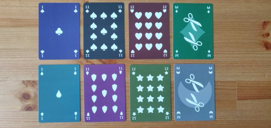


Jokers

As with standard decks, the jokers are a bit more elaborate.
They pay tribute to all other alternative suits and show a transparent version of them in the background.

The four jokers in the standard suits show their equivalent Latin and Germanic suits.
The four jokers in the alternative suits are grouped by theme and show suits which are used in other alternative suits: Drops show anchors and shells, shields show horseshoes and horns, stars show steering wheels and jewels, moons show suns and crowns.
(The crown is the only symbol which doesn’t really fit into the theme of moons, but I couldn’t fit it anywhere else.)

I’ve also added a transparent suit to the jokers’ indices, so they can potentially be treated as other face cards. It also adds a way to distinguish them for colourblind people when fanning.
There is just a dot where the rank would be. Most decks use a star, but because the star was already taken for an alternative suit, I had to use something else. In the improved version I changed that to the reference symbol as I found the dot to be a bit too bold.
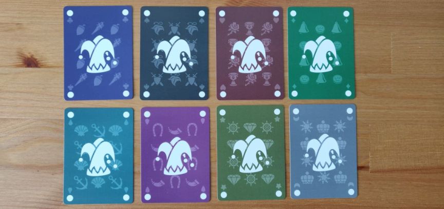


Back

I wanted something simple and classic for the back. I added a border to prevent potential cheating. But because the front has different background colours, this deck will probably not be good for magicians. But the light version might be.
I’ve read that a dark background makes it more likely to show signs of wear and tear. But having a light background or border would look really weird with this dark design. So, I’ve kept it.


Credits

All icons come from the brilliant game-icons.net.
The font in the improved version is Voltaire.
The design is my own, obviously inspired by hundreds of other decks.
The print is by MakePlayingCards.

The graphic software I used to create the deck is… none!
I am a web developer and had started designing the deck in pure HTML and CSS. I had planned to move over a more sophisticated graphic design software, like Inkscape or The Gimp. But when I tried that it just slowed me down a lot. So, I stuck with HTML and CSS and made huge screenshots of each card.
And to my surprise the quality of the print looks as good as if I had used a graphics tool. You really cannot tell that it was not made with a more appropriate tool.


Improved version

What I have improved so far:
  • Pips are mirrored
  • Blue and green are swapped
  • Indices are bigger
  • Font for indices is more appropriate
  • Joker “rank” symbol changed from dot to reference symbol ※ (not pictured)
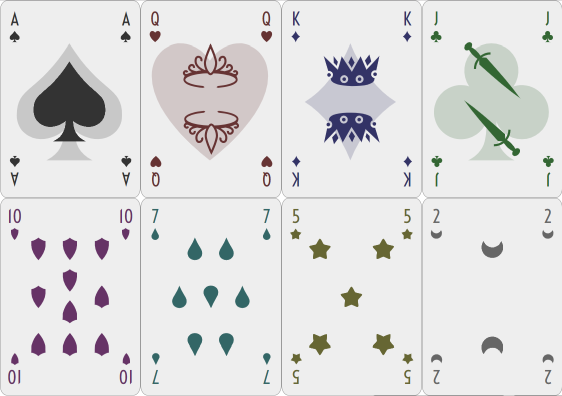
  • Added version with white background

What I still plan to add are two more face cards.
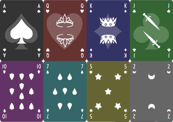


And the white background version. (The background is more of an off white, I might change that to pure white, don’t know yet.)


Questions

I’d love to get general feedback on things I can improve.

Three main questions:
Any ideas for a good medium rank pair?
Do you know if having different backgrounds on the front of the cards can show the colour from the side and would therefore reveal the suit and be detrimental to playing with them?
What should I name this deck?

If I’m going to open this up on MPC’s marketplace, what would people be interested in? Dark or light? Poker or Bridge or other size? One deck of a whopping 162 cards or divided into 3 sub-decks of standard 55 cards (1x standard deck, 1x alternative suits deck, 1x alternative ranks deck)? “330gsm superior smooth” or “310gsm linen” card stock? This 4 or a more classic 2 colour deck (or rather 4 instead of 8 colours)?
« Last Edit: February 09, 2019, 06:24:58 AM by selfthinker »
 

Re: Seeking feedback for my minimalistic deck of (extended) playing cards
« Reply #1 on: February 09, 2019, 02:11:47 PM »
 

selfthinker

  • Newcomer
  • *
  • 8
    Posts
  • Reputation: 0
Quote
Any ideas for a good medium rank pair?

I've decided to use Cavalier and Lady. Not only is the Knight already called Cavalier in some decks, and a Lady or Dame is the female equivalent of a Knight, apparently there is one historic deck which put all of them together the same way I did:
Quote
Many early tarot decks had added female ranks into the face cards including the Cary-Yale deck which added queens, mounted ladies, and maids as counterparts to the males.
(Quote from Wikipedia)
I guess that's settled then. :)

I'm also contemplating a version with paired colours like in standard decks, so black for clubs and red for diamonds, plus other paired colours for the other four suits.

Here is a picture showing both the new face cards (and all the others) and only paired colours:


Re: Seeking feedback for my minimalistic deck of (extended) playing cards
« Reply #2 on: February 13, 2019, 04:00:28 PM »
 

selfthinker

  • Newcomer
  • *
  • 8
    Posts
  • Reputation: 0
Quote
(re: ranks) I played around with mirroring the background as well. It would make more sense but then it was more difficult to see the main image in some cases.
I've actually now found a design that works well with a mirrored background.

Quote
What should I name this deck?
I went through a couple of potential names with some friends and the current working title is "Ika Deck".

I'd still very much like feedback and other people's opinions before I order another print next week.
 

Re: Seeking feedback for my minimalistic deck of (extended) playing cards
« Reply #3 on: February 16, 2019, 06:10:32 AM »
 

Don Boyer

  • VP/Dir. Club Forum/DAC Chair, 52 Plus Joker
  • Administrator
  • Forum Sentinel
  • *
  • 19,172
    Posts
  • Reputation: 415
  • Pick a card, any card...no, not THAT card!

  • Facebook:
Suggestions:

Simplify the shapes for the suits a wee bit, but make them more distinct.  For example, the water drop and shield look kind of similar.  Why not a square, a circle, a triangle - things that are distinct from each other and distinctly different from existing suits?

I like the colored backgrounds for easier identification of these unique suits, but you might want to use white borders on the faces and backs.  As you've already noticed, having a colored background printed into the bleed (right up to the cut edge of the card) makes that color visible from the deck's side.  It's why white-bordered decks are so popular in general.  That and also that the white will conceal the eventual edge chipping damage that occur with frequent usage and shuffling.  I'm sure you're already starting to notice that after a few shuffles, the edges of your full-color cards are a bit worse for wear.

You were looking for ranks in male-female pairs - why look for gender-specific ranks at all?  What's wrong with using military ranks?  They're unisex and easily identified.  You could pick officer ranks and stick with just with the silver ranks (they're generally higher than their gold counterparts anyway).  Lieutenant (one vertical bar), captain (two vertical bars), lieutenant colonel (oak leaf cluster), colonel (eagle with spread wings), general (five-pointed star).  If you need more ranks than that, just add more general stars, up to five (which would appear in a circle, rather than in a straight line).

The advantage of using military ranks is that they're already out there, easily recognized and few people will need to "interpret" or remember which ranks are higher than which ranks.  Most people these days have at least a passing familiarity with military ranks because they're are many soldiers out there and the same rank symbols are often used in civilian settings, such as with police departments.  Anyone not fully knowledgeable can quickly figure out the ones they don't already know.  I think it would make the game a little more accessible, adding an element of familiarity to it that it wouldn't otherwise already have.
Card Illusionist, NYC Area
Playing Card Design & Development Consultant
Deck Tailoring: Custom Alterations for Magicians and Card Mechanics
Services for Hire - http://thedecktailor.com/
Pre-Made Decks for Sale - http://donboyermagic.com/
 

Re: Seeking feedback for my minimalistic deck of (extended) playing cards
« Reply #4 on: February 17, 2019, 05:30:19 AM »
 

selfthinker

  • Newcomer
  • *
  • 8
    Posts
  • Reputation: 0
Thanks for your feedback.

Other shapes for the suits I tried right after adding stars and before thinking of others were the simplest shapes you mention: squares, circles, triangles. But they were too simple and didn't look right. I guess a proper designer might come up with a reason why. My guess is because squares, circles and triangles don't have any curves like the French suits have.

I quite like that the drop and the shield look similar, nearly mirrored. That makes them similar in concept to hearts and spades. But I could make the shield broader, that would make them a bit more distinguishable from each other.

Just adding a simple white border wouldn't be very aesthetic. But seeing the colours from the sides are not very functional. And function should trump aesthetics. I will play more around with a potential border.

Using military ranks for face cards would be a good idea if you also got rid of the Jack, Queen and King.
I was looking for gender-specific ranks because the standard face cards are already gender-specific. The Jack and King are clearly male and the Queen is clearly female. On the one hand I'd prefer gender-neutral ranks, like Servant, Captain, Emperor (Captain instead of the Knight not the Queen, to keep the clear ranks). But on the other hand I don't want to mess with the standard deck.
If I'd like to keep Jack, Queen, King, it makes sense to add their equivalents. I'm quite happy with my additional Maid, Cavalier and Lady, especially as the same (altogether) 6 ranks have already existed in history in the same deck before.
And having pairs would potentially also make for an additional game mechanic.
 

Re: Seeking feedback for my minimalistic deck of (extended) playing cards
« Reply #5 on: February 18, 2019, 12:55:56 AM »
 

Don Boyer

  • VP/Dir. Club Forum/DAC Chair, 52 Plus Joker
  • Administrator
  • Forum Sentinel
  • *
  • 19,172
    Posts
  • Reputation: 415
  • Pick a card, any card...no, not THAT card!

  • Facebook:
Thanks for your feedback.

Other shapes for the suits I tried right after adding stars and before thinking of others were the simplest shapes you mention: squares, circles, triangles. But they were too simple and didn't look right. I guess a proper designer might come up with a reason why. My guess is because squares, circles and triangles don't have any curves like the French suits have.

I quite like that the drop and the shield look similar, nearly mirrored. That makes them similar in concept to hearts and spades. But I could make the shield broader, that would make them a bit more distinguishable from each other.

Just adding a simple white border wouldn't be very aesthetic. But seeing the colours from the sides are not very functional. And function should trump aesthetics. I will play more around with a potential border.

Using military ranks for face cards would be a good idea if you also got rid of the Jack, Queen and King.
I was looking for gender-specific ranks because the standard face cards are already gender-specific. The Jack and King are clearly male and the Queen is clearly female. On the one hand I'd prefer gender-neutral ranks, like Servant, Captain, Emperor (Captain instead of the Knight not the Queen, to keep the clear ranks). But on the other hand I don't want to mess with the standard deck.
If I'd like to keep Jack, Queen, King, it makes sense to add their equivalents. I'm quite happy with my additional Maid, Cavalier and Lady, especially as the same (altogether) 6 ranks have already existed in history in the same deck before.
And having pairs would potentially also make for an additional game mechanic.

First of all, circles DO have curves - or at least one continuous curve.

Second, Emperor is NOT gender-neutral. The feminine would be Empress.

The issue you’re going to hit is you have a minimalist design - images WITHOUT gender. Pulling names, gender-neutral or otherwise, out of a hat and using their one-letter abbreviation just doesn’t work well without forcing people to learn not just the new names but where they fit in the rank structure, adding complexity. Using existing military rank symbols instead makes this LESS COMPLEX and easier to learn. For example, you have an “E” of hearts - is that Emperor, Elephant, Elbow? Does that rank higher or lower than Queen? New system to learn and memorize does not equal easy and fun.

If you wanted TRULY minimalist, you’d eliminate courts and just go with numerical ranks!


Sent from my iPhone using Tapatalk
Card Illusionist, NYC Area
Playing Card Design & Development Consultant
Deck Tailoring: Custom Alterations for Magicians and Card Mechanics
Services for Hire - http://thedecktailor.com/
Pre-Made Decks for Sale - http://donboyermagic.com/
 

Re: Seeking feedback for my minimalistic deck of (extended) playing cards
« Reply #6 on: February 18, 2019, 03:53:19 PM »
 

selfthinker

  • Newcomer
  • *
  • 8
    Posts
  • Reputation: 0
Quote
circles DO have curves - or at least one continuous curve.

Circles were the only simple suit I left in at first - for the jokers. But they didn't even fit there which is why I removed them again. As I mentioned above, the suits that fit well seemed to be those which "have at least one curve and one spike and are vertically symmetric".

Quote
Emperor is NOT gender-neutral. The feminine would be Empress.

Ah, I didn't know that. Sovereign or Monarch would also do, you get the gist.
But I'm not using those anyway.

Quote
Using existing military rank symbols instead makes this LESS COMPLEX and easier to learn.

Although I don't know the military ranks, the way you have described their symbols seems to be quite intuitive. Let's assume it will be really easy for people to rank them all. The problem will be how do you decide which one is the Jack, the Queen and the King?

I don't want to break up the familiarity of a standard deck, I'm only extending it. I don't think learning three more ranks will be as complex as you make it sound. And it's really only two more ranks as the Cavalier exists in other decks. (Although it's subtle, the pairs also share the direction of their symbol, providing a memory hook for their rank.)
 

Re: Seeking feedback for my minimalistic deck of (extended) playing cards
« Reply #7 on: February 19, 2019, 06:40:23 AM »
 

Don Boyer

  • VP/Dir. Club Forum/DAC Chair, 52 Plus Joker
  • Administrator
  • Forum Sentinel
  • *
  • 19,172
    Posts
  • Reputation: 415
  • Pick a card, any card...no, not THAT card!

  • Facebook:
Quote
circles DO have curves - or at least one continuous curve.

Circles were the only simple suit I left in at first - for the jokers. But they didn't even fit there which is why I removed them again. As I mentioned above, the suits that fit well seemed to be those which "have at least one curve and one spike and are vertically symmetric".

Then you're intentionally narrowing you available pool of shapes to only those that look very similar to suit pips that are already in use - which was kind of my point in the first place.  Better to go with shapes that are simple but at the same time not too close to standard pips, giving them both familiarity and ease of distinguishability.

Quote
Quote
Using existing military rank symbols instead makes this LESS COMPLEX and easier to learn.

Although I don't know the military ranks, the way you have described their symbols seems to be quite intuitive. Let's assume it will be really easy for people to rank them all. The problem will be how do you decide which one is the Jack, the Queen and the King?

I don't want to break up the familiarity of a standard deck, I'm only extending it. I don't think learning three more ranks will be as complex as you make it sound. And it's really only two more ranks as the Cavalier exists in other decks. (Although it's subtle, the pairs also share the direction of their symbol, providing a memory hook for their rank.)

Military rank symbols aren't difficult and are used practically everywhere in the world.  There are variances between services but the symbols used are still in the same order.  I'll show you the full set of officer ranks, but you need only use the ones that appear in silver, as there are more of them and it eliminates color as a factor since you'd already be using that with your suits.  The first title will be what the symbol represents in the Army, Air Force and Marine Corp, while the second title will be what the symbol represents in the Navy and Coast Guard, while the final "O-" number is what the ranks are referred to by the Pentagon when determining equivalency between services and pay grade.

Second Lieutenant/Ensign/O-1
First Lieutenant/Lieutenant Junior Grade/O-2
Captain/Lieutenant/O-3
Major/Lieutenant Commander/O-4
Lieutenant Colonel/Commander/O-5
Colonel/Captain/O-6
Brigadier General/Rear Admiral Lower Half/O-7
Major General/Rear Admiral Upper Half/O-8
Lieutenant General/Vice Admiral/O-9
General/Admiral/O-10
General of the Army (or General of the Air Force; no Marine Corps equivalent)/Fleet Admiral/one-of-a-kind rank only previously used in wartime.

With all those ranks to play with, leaving out the gold ranks and using the silver ones in whatever colors you're using for a given suit, that gives you as many as nine "court" level ranks.  With all those ranks to play with, would anyone miss Jack, Queen or King all that much?  If you think they will, you could simply place those "royalty" ranks above the military ranks, and only use the first "general/admiral" rank - five military ranks plus three court ranks is a total of eight ranks, not counting your numerical ranks.

I suggested military rank symbols just because they're pretty universal throughout the world - you might include a card to go with the deck to clue in people who don't know the ranks themselves, but they're used in almost every military worldwide, making them as universal as chess symbols.

Hey, there's a thought...  Chess symbols.  Most people have at least a passing familiarity with chess, as well.  That's another alternative to using made-up ranks.  You'd have number ranks, then "pawn", "knight", "bishop", "rook" and J, Q and K for Jack, Queen and King.  Use the symbols instead of the letters for those ranks of pawn through rook.  Now, there are those who might argue that you should show them in order of how they appear on a chess board, from outside to inside: pawn, rook, knight, bishop, then the royals.  But any chess player will tend to rank them in terms of how powerful they are, and looked at that way, rooks are more powerful than knights or bishops.

Still, while the chess symbols are a possibility, there's the ambiguity of the ranks of the symbols, which a non-player of chess may not necessarily know - and even some chess players may argue about whether a bishop really is more valuable than a knight in all situations.  At least with the military ranks, there's zero ambiguity about what rank is higher than what other rank - and that was the point I was trying to make all along.  NO ambiguity whatsoever, built-in rank order, anyone can look it up, work it out, it's universal anywhere these ranks are employed.  Even some police departments use at least some of these symbols - the NYPD employs lieutenant and captain ranks as well as sergeant stripes as an "enlisted" rank higher than a patrol officer but lower than the lieutenant.

If you're making something that's truly minimal and requires the least amount of explanation, military officer rank symbols are the least ambiguous way to show higher ranked cards, short of eliminating a "second tier" of ranks and simply going entirely numerical.
Card Illusionist, NYC Area
Playing Card Design & Development Consultant
Deck Tailoring: Custom Alterations for Magicians and Card Mechanics
Services for Hire - http://thedecktailor.com/
Pre-Made Decks for Sale - http://donboyermagic.com/
 

Re: Seeking feedback for my minimalistic deck of (extended) playing cards
« Reply #8 on: April 15, 2019, 04:09:40 AM »
 

selfthinker

  • Newcomer
  • *
  • 8
    Posts
  • Reputation: 0
Quote
Hey, there's a thought...  Chess symbols.  Most people have at least a passing familiarity with chess, as well.  That's another alternative to using made-up ranks.

The K6T Deck uses chess ranks. When I first saw that I quite liked it.
But my intention was to take a normal set of playing cards, keep the standard cards, but extend it in a logical way. The minimalism is only about the design for me, not the suits or ranks.

I've now printed my second version, both with a dark and a light background. And I really like it. I also finally named it properly, I call it the Micaya Deck.
I have made them available on MPC's marketplace and created a little website for them: http://micaya.selfthinker.org/

Here are some photos of the final version:

« Last Edit: April 15, 2019, 04:16:31 AM by selfthinker »
 

Re: Seeking feedback for my minimalistic deck of (extended) playing cards
« Reply #9 on: April 15, 2019, 05:11:52 AM »
 

Don Boyer

  • VP/Dir. Club Forum/DAC Chair, 52 Plus Joker
  • Administrator
  • Forum Sentinel
  • *
  • 19,172
    Posts
  • Reputation: 415
  • Pick a card, any card...no, not THAT card!

  • Facebook:
It's a nice effort, but the dark-background version has a serious flaw.  Because the printing of the dark background is into the bleed and different for each suit color, you'll be able to distinguish suit colors from looking at the EDGE of the deck.  You may as well have marked them for suit, or at least suit color - the end result is the same.
Card Illusionist, NYC Area
Playing Card Design & Development Consultant
Deck Tailoring: Custom Alterations for Magicians and Card Mechanics
Services for Hire - http://thedecktailor.com/
Pre-Made Decks for Sale - http://donboyermagic.com/