You are Here:
The second edition of the Lumberjacks

Author (Read 43612 times)

Re: The second edition of the Lumberjacks
« Reply #175 on: December 16, 2014, 05:33:20 PM »
 

Vadim Smolenskiy

  • Discourse Lover
  • *
  • 202
    Posts
  • Reputation: 6
  • 2nd Edition

  • Facebook:

  • Kickstarter:

  • Twitter:
I think the jokers are the cherry on top!  You can sense the movement with the way they are positioned and the sawdust on the end of the stroke.  Nicely done!

:) thank you very much!

Tuck design is next! (it's done, I'm just making some final tweaks / additions). I also got in touch with my Rep at USPCC and I'm getting the ball rolling on approvals tomorrow. I hope to have everything sent to them by the end of the week!

Thanks guys!
 

Re: The second edition of the Lumberjacks
« Reply #176 on: December 16, 2014, 10:05:13 PM »
 

piratebear81

  • 52 Plus Joker Member
  • Junior Member
  • *
  • 30
    Posts
  • Reputation: 4
I think these look great.  I loved the first edition too, btw! I can't wait to pledge on these.  Great work!
 

Re: The second edition of the Lumberjacks
« Reply #177 on: December 17, 2014, 03:56:41 PM »
 

Vadim Smolenskiy

  • Discourse Lover
  • *
  • 202
    Posts
  • Reputation: 6
  • 2nd Edition

  • Facebook:

  • Kickstarter:

  • Twitter:
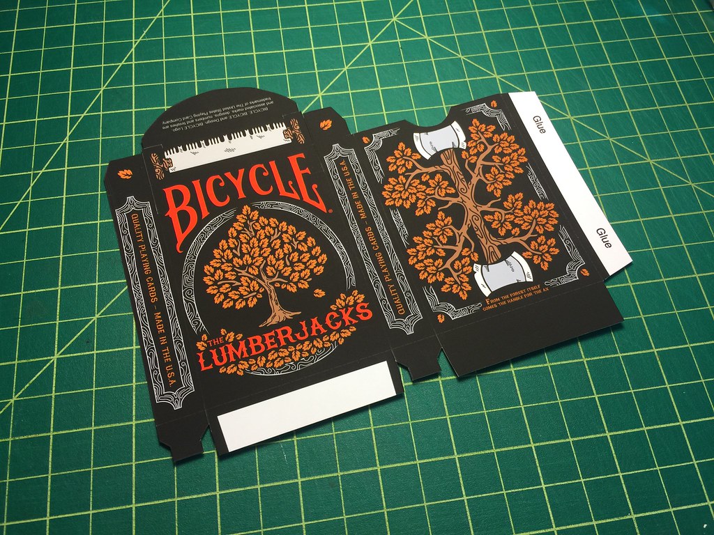
Okay, here we go, the tuck box! I'm lucky enough to have a pretty beast printer at work that prints really high-quality stuff. So I ran off a few "prototypes" to see what the real thing may look like and if anything gets lost or looks weird.

Freshly cut

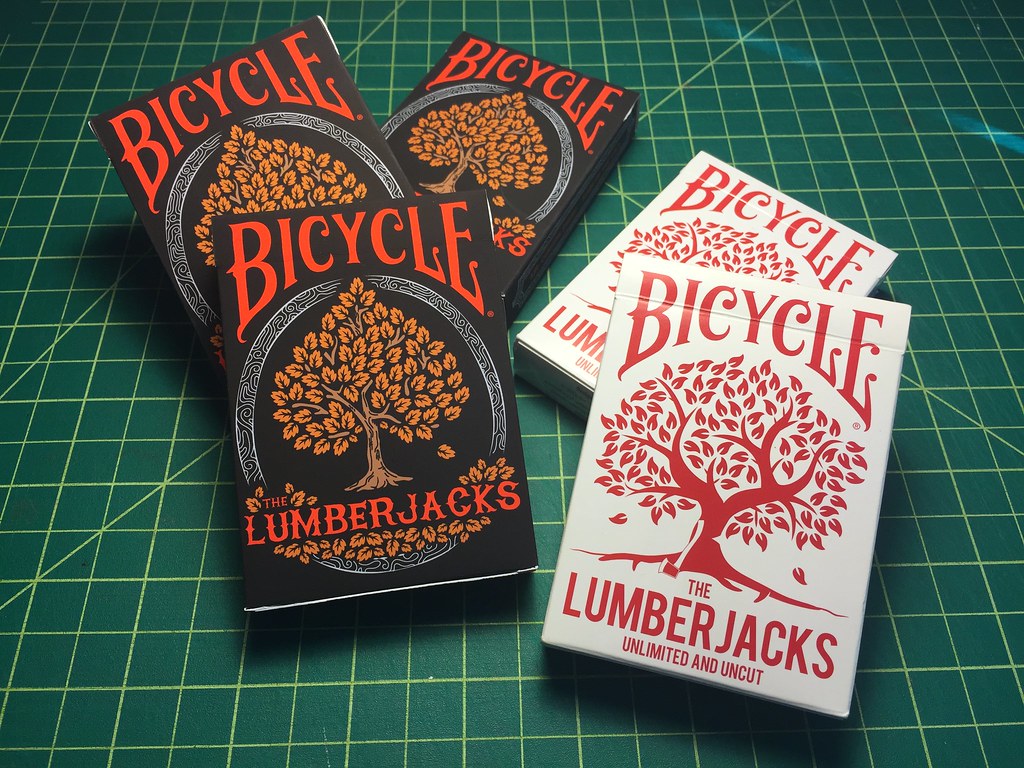
Glued up! I added the original deck to show how the new one pay homage to it.

Backs.


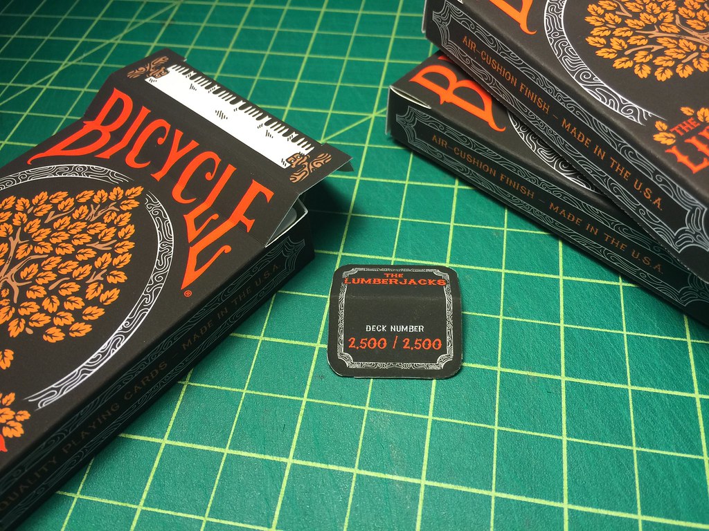
What's this, a seal?! Yep, these things will come sealed this time! I'll opt in for custom numbered seals too.

Real pixels
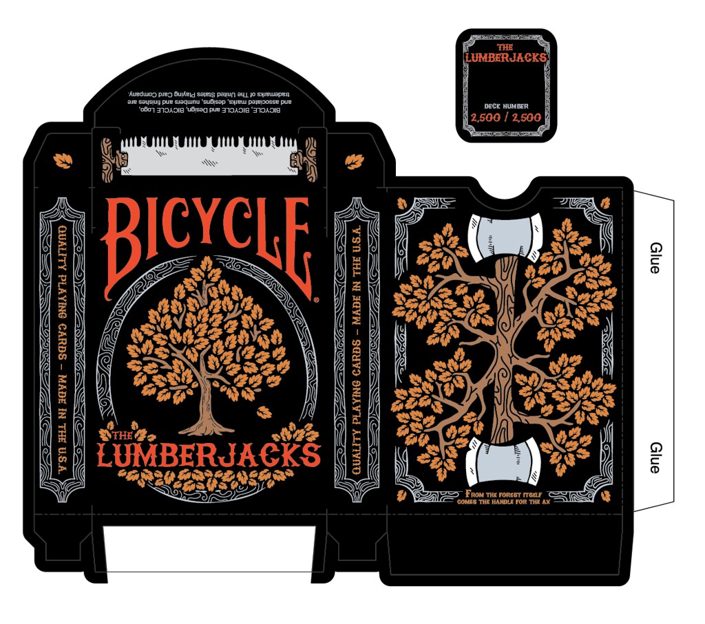

Lastly, I wanted to mention and point out somethings.

As you can see, both tucks have similarities which I thought was important as this is the second edition. I decided to show the Ace of Spades on the front to follow in the foot steps of the "Standard Bicycle" deck and many other decks that feature the AoS on the front. The first edition also featured a tree on the front but that tree wasn't found anywhere else in the deck. The font changed from "Bebas" to "High On Fire" which I think matches the feel of lumberjacks / woods better than before.

The back design, which y'all have already seen also pays homage to the original. Both have trees, axes, leaves in the corners, and a caption. Although this time the leaves have been revamped, the rope has been removed and replaced with a woodgrain border (which is a theme throughout the deck) and the axes are incorporated into the tree.

The top and sides... The axes have been removed from the top of the tuck and replaced with a two-man saw (that is also featured on the Jack of Hearts and both the Jokers). On the sides, the old rope has been removed and replaced with the woodgrain mentioned earlier and a small text change was made from "Air-Cushioned Finished - Made in the U.S.A." to "Quality Playing Cards - Made in the U.S.A." huge change, I know! (this is still in the air).

And of course, the biggest addition (not really) is the seal. It was non existent on the first deck (which was a huge mistake). It features the name and number of the deck again paying homage to the original. I left a decent amount of space in the middle so when you guys open it, you can leave it and it'll still have meaning.

I need a gaff card and then done and off it goes to USPCC for approval. Tell me what you guys think.
 

Re: The second edition of the Lumberjacks
« Reply #178 on: December 17, 2014, 04:42:46 PM »
 

Will W.

  • Discourse Veteran
  • *
  • 274
    Posts
  • Reputation: 10
Looks great!  One question for you though. Are you going to offer the original Lumberjacks on your kickstarter as well?  Maybe as an add on or in a tier where you get one of each. The only reason I ask is because I missed out on the original and have yet to acquire it but would like to.  ;D
"I collect these objects to learn from them. In some moment these things are going to teach me something. For me, this is like a library. These are my books."
- Jose Bedia
 

Re: The second edition of the Lumberjacks
« Reply #179 on: December 17, 2014, 06:33:48 PM »
 

Vadim Smolenskiy

  • Discourse Lover
  • *
  • 202
    Posts
  • Reputation: 6
  • 2nd Edition

  • Facebook:

  • Kickstarter:

  • Twitter:
Looks great!  One question for you though. Are you going to offer the original Lumberjacks on your kickstarter as well?  Maybe as an add on or in a tier where you get one of each. The only reason I ask is because I missed out on the original and have yet to acquire it but would like to.  ;D

I don't see why not!
 

Re: The second edition of the Lumberjacks
« Reply #180 on: December 17, 2014, 09:14:04 PM »
 

Will W.

  • Discourse Veteran
  • *
  • 274
    Posts
  • Reputation: 10
Looks great!  One question for you though. Are you going to offer the original Lumberjacks on your kickstarter as well?  Maybe as an add on or in a tier where you get one of each. The only reason I ask is because I missed out on the original and have yet to acquire it but would like to.  ;D

I don't see why not!
Thats awesome!   :D
"I collect these objects to learn from them. In some moment these things are going to teach me something. For me, this is like a library. These are my books."
- Jose Bedia
 

Re: The second edition of the Lumberjacks
« Reply #181 on: December 17, 2014, 10:47:01 PM »
 

10ofclubs

  • Discourse Veteran
  • *
  • 251
    Posts
  • Reputation: 22
The jokers are sweet! But, to me, it looks like the sawdust is on the wrong side. The red guy looks like he is pulling and the blue guy is pushing so the saw would be moving to the left. And that would make the dust travel left? Right?
 

Re: The second edition of the Lumberjacks
« Reply #182 on: December 17, 2014, 11:31:01 PM »
 

Will W.

  • Discourse Veteran
  • *
  • 274
    Posts
  • Reputation: 10
The jokers are sweet! But, to me, it looks like the sawdust is on the wrong side. The red guy looks like he is pulling and the blue guy is pushing so the saw would be moving to the left. And that would make the dust travel left? Right?
The sawdust is at the end of the stroke, right before the return stroke. Its on the proper side.
"I collect these objects to learn from them. In some moment these things are going to teach me something. For me, this is like a library. These are my books."
- Jose Bedia
 

Re: The second edition of the Lumberjacks
« Reply #183 on: December 19, 2014, 12:13:45 PM »
 

Vadim Smolenskiy

  • Discourse Lover
  • *
  • 202
    Posts
  • Reputation: 6
  • 2nd Edition

  • Facebook:

  • Kickstarter:

  • Twitter:
The jokers are sweet! But, to me, it looks like the sawdust is on the wrong side. The red guy looks like he is pulling and the blue guy is pushing so the saw would be moving to the left. And that would make the dust travel left? Right?
The sawdust is at the end of the stroke, right before the return stroke. Its on the proper side.

Yep, exactly! Thanks Will!

Good news, I've submitted all the artwork to USPCC for approval! Hope everything goes smoothly. I read over their guidelines and had to change my King of Hearts (because it would've gone against their policy).

I'll keep you guys posted on updates, more artwork (custom brick boxes) and other things as they come up!

Feel free to comment / ask questions!
 

Re: The second edition of the Lumberjacks
« Reply #184 on: December 30, 2014, 03:56:38 PM »
 

Vadim Smolenskiy

  • Discourse Lover
  • *
  • 202
    Posts
  • Reputation: 6
  • 2nd Edition

  • Facebook:

  • Kickstarter:

  • Twitter:
WOOOHOOO! Legal approved the deck!

Hope everyone had a wonderful holiday and I wish you all an awesome New Year!

Kleetz
 

Re: The second edition of the Lumberjacks
« Reply #185 on: December 30, 2014, 06:03:41 PM »
 

Fess

  • 52 Plus Joker Member
  • Aficionado
  • *
  • 1,444
    Posts
  • Reputation: 26
  • ;)
WOOOHOOO! Legal approved the deck!

Hope everyone had a wonderful holiday and I wish you all an awesome New Year!

Kleetz

Great News! Happy New Year to you as well. :)
Part of my Collection updated infrequently but occasionally, when I remember. (I haven't in months.)
 

Re: The second edition of the Lumberjacks
« Reply #186 on: December 31, 2014, 01:21:38 AM »
 

Don Boyer

  • VP/Dir. Club Forum/DAC Chair, 52 Plus Joker
  • Administrator
  • Forum Sentinel
  • *
  • 19,172
    Posts
  • Reputation: 415
  • Pick a card, any card...no, not THAT card!

  • Facebook:
WOOOHOOO! Legal approved the deck!

Hope everyone had a wonderful holiday and I wish you all an awesome New Year!

Kleetz

Awesomesauce, dipped in a side of fantastic!
Card Illusionist, NYC Area
Playing Card Design & Development Consultant
Deck Tailoring: Custom Alterations for Magicians and Card Mechanics
Services for Hire - http://thedecktailor.com/
Pre-Made Decks for Sale - http://donboyermagic.com/
 

Re: The second edition of the Lumberjacks
« Reply #187 on: January 09, 2015, 04:02:55 PM »
 

Vadim Smolenskiy

  • Discourse Lover
  • *
  • 202
    Posts
  • Reputation: 6
  • 2nd Edition

  • Facebook:

  • Kickstarter:

  • Twitter:
Hey guys,

It's sorta been a bit and I wanted to post an update. It's a pretty good one too!

I've been working on creating a very straight forward website for people to go to and subscribe to get notified when the 2nd edition Lumberjacks are on Kickstarter.

www.lumberjackplayingcards.com/2ndedition/

Check it out, and if you're interested in knowing when the campaign is live, subscribe! I will NOT email you any non-sense. You will only get an email when it's live!

Again, very straight forward, but once the campaign is finished (and if successful) I will be redoing both sites and combining both decks into one, better store.

Thanks!
« Last Edit: January 09, 2015, 04:03:48 PM by Kleetz »
 

Re: The second edition of the Lumberjacks
« Reply #188 on: January 13, 2015, 12:11:11 PM »
 

Collector

  • Discourse Deity
  • *
  • 532
    Posts
  • Reputation: 23
  • I can be ironic, but I never outrage anyone.

  • Facebook:

  • Tumblr:

  • Twitter:
IMHO:

I prefer darker blue on previous variant of “black” suits.
 
The Ace of Clubs – I believe both fronds can’t be at such a right angle to main trunk. Try some more natural form of a tree.

The King of Spades – try to make his hair “thicker”. His hair happened to be sleeked too much.

The Queen of Hearts – Changed hair created some disproportion of her overall head. Try to add more hair to her left temple.

The Jack of Clubs – I don’t know what to say – the worst face from the deck. Something is wrong with it. I can only propose to redesign it (face and hair) form the scratch. Also I believe you can pull down a little a shirt-sleeve of his shirt (right hand).

The King of Diamonds – right hand?

The Queen of Diamonds – her arms of a dystrophic are awful (that log should broke them, actually) – stub-fingers. Try to add hair to the crown of her head and make two plaits.

The Seal is really uninteresting. Can you add an acorn (or some stump?) on it? Place the name of the deck on such acorn.

Can you try to hide “the” on the front of the tuck case in roots of the tree? It will be the deck with a small hidden element on its tuck cases :)

This is really a nice deck, even better than the first edition. Good luck.
« Last Edit: January 13, 2015, 12:12:31 PM by Collector »


------------------------------------------------------------------------------------------------------------------------------------------------------
"Life consists not in holding good cards, but in collecting beautiful ones" ~ PlayingCardCollector.net
 

Re: The second edition of the Lumberjacks
« Reply #189 on: January 13, 2015, 11:41:15 PM »
 

Don Boyer

  • VP/Dir. Club Forum/DAC Chair, 52 Plus Joker
  • Administrator
  • Forum Sentinel
  • *
  • 19,172
    Posts
  • Reputation: 415
  • Pick a card, any card...no, not THAT card!

  • Facebook:
IMHO:

I prefer darker blue on previous variant of “black” suits.
 
The Ace of Clubs – I believe both fronds can’t be at such a right angle to main trunk. Try some more natural form of a tree.

The King of Spades – try to make his hair “thicker”. His hair happened to be sleeked too much.

The Queen of Hearts – Changed hair created some disproportion of her overall head. Try to add more hair to her left temple.

The Jack of Clubs – I don’t know what to say – the worst face from the deck. Something is wrong with it. I can only propose to redesign it (face and hair) form the scratch. Also I believe you can pull down a little a shirt-sleeve of his shirt (right hand).

The King of Diamonds – right hand?

The Queen of Diamonds – her arms of a dystrophic are awful (that log should broke them, actually) – stub-fingers. Try to add hair to the crown of her head and make two plaits.

The Seal is really uninteresting. Can you add an acorn (or some stump?) on it? Place the name of the deck on such acorn.

Can you try to hide “the” on the front of the tuck case in roots of the tree? It will be the deck with a small hidden element on its tuck cases :)

This is really a nice deck, even better than the first edition. Good luck.

The suggestions are nice, but not terribly timely.  He's been posting about this deck for THIRTEEN months!  Where were you when he was hammering all this stuff out, taking people's advice and tweaking the design to improve it?  He's practically ready to go to press and we already gave him enough recommendations to cause migraines!
« Last Edit: January 13, 2015, 11:42:20 PM by Don Boyer »
Card Illusionist, NYC Area
Playing Card Design & Development Consultant
Deck Tailoring: Custom Alterations for Magicians and Card Mechanics
Services for Hire - http://thedecktailor.com/
Pre-Made Decks for Sale - http://donboyermagic.com/
 

Re: The second edition of the Lumberjacks
« Reply #190 on: January 14, 2015, 04:46:05 AM »
 

Magasaki

  • 52 Plus Joker Member
  • Discourse Lover
  • *
  • 244
    Posts
  • Reputation: 9
I wasn't so sure at the start but this has come together as a really nice project. Will be happy if you offer the original lumberjacks as an add on too, I'll definatly be in for a few. Good Luck!
Collection and Blog - www.magasaki.com
Studio - www.designsharp.co.uk
Blog Facebook - www.facebook.com/magasakicards
Personal Facebook - www.facebook.com/tommajski
 

Re: The second edition of the Lumberjacks
« Reply #191 on: January 14, 2015, 05:28:26 PM »
 

Vadim Smolenskiy

  • Discourse Lover
  • *
  • 202
    Posts
  • Reputation: 6
  • 2nd Edition

  • Facebook:

  • Kickstarter:

  • Twitter:

The suggestions are nice, but not terribly timely.  He's been posting about this deck for THIRTEEN months!  Where were you when he was hammering all this stuff out, taking people's advice and tweaking the design to improve it?  He's practically ready to go to press and we already gave him enough recommendations to cause migraines!

This is relatively true haha, but there is still some time left! I've been putting together all the necessary things for Kickstarter, as well as building that subscribe site. Still got to take photos and video so I'll be looking over what Collector said and seeing if I can make some of those changes / see what things will look like. Although I think a JoC redesign is not in the cards (haha get it, get it).

I wasn't so sure at the start but this has come together as a really nice project. Will be happy if you offer the original lumberjacks as an add on too, I'll definatly be in for a few. Good Luck!

Yes sir, I will have the originals as an addition in the campaign. Glad to hear you like it! It's definitely been a journey... and it's not even close to over!

Thanks for the comments guys!
 

Re: The second edition of the Lumberjacks
« Reply #192 on: January 25, 2015, 07:27:26 PM »
 

Collector

  • Discourse Deity
  • *
  • 532
    Posts
  • Reputation: 23
  • I can be ironic, but I never outrage anyone.

  • Facebook:

  • Tumblr:

  • Twitter:
IMHO:

I prefer darker blue on previous variant of “black” suits.
 
The Ace of Clubs – I believe both fronds can’t be at such a right angle to main trunk. Try some more natural form of a tree.

The King of Spades – try to make his hair “thicker”. His hair happened to be sleeked too much.

The Queen of Hearts – Changed hair created some disproportion of her overall head. Try to add more hair to her left temple.

The Jack of Clubs – I don’t know what to say – the worst face from the deck. Something is wrong with it. I can only propose to redesign it (face and hair) form the scratch. Also I believe you can pull down a little a shirt-sleeve of his shirt (right hand).

The King of Diamonds – right hand?

The Queen of Diamonds – her arms of a dystrophic are awful (that log should broke them, actually) – stub-fingers. Try to add hair to the crown of her head and make two plaits.

The Seal is really uninteresting. Can you add an acorn (or some stump?) on it? Place the name of the deck on such acorn.

Can you try to hide “the” on the front of the tuck case in roots of the tree? It will be the deck with a small hidden element on its tuck cases :)

This is really a nice deck, even better than the first edition. Good luck.

The suggestions are nice, but not terribly timely.  He's been posting about this deck for THIRTEEN months!  Where were you when he was hammering all this stuff out, taking people's advice and tweaking the design to improve it?  He's practically ready to go to press and we already gave him enough recommendations to cause migraines!

I was here when I could and stipulated my endless IMHOs. Check this thread. I said what I said when I could do that. More explanations are in "Oscar" thread.

I am sure there are still enough days for improvements of this deck ;)


------------------------------------------------------------------------------------------------------------------------------------------------------
"Life consists not in holding good cards, but in collecting beautiful ones" ~ PlayingCardCollector.net
 

Re: The second edition of the Lumberjacks
« Reply #193 on: January 27, 2015, 10:23:11 AM »
 

Vadim Smolenskiy

  • Discourse Lover
  • *
  • 202
    Posts
  • Reputation: 6
  • 2nd Edition

  • Facebook:

  • Kickstarter:

  • Twitter:
Hey guys,

Sorry I haven't posted anything in a while. So here's a progress update!

I've been working on promotional photography for the Lumberjacks, getting prototype cards printed and looking for a cardist near my area for the video. That last one was a real challenge.

The good news is all three things are done!

Here's a preview of the photos (please keep in mind that these are mocks that I made using my in house printer):
Tuck


Aces:


The prototype cards (even though they were printed by a 3rd party printer) look really cool. I'll post some photos of them as well. I'm currently storyboarding the video and building the KS campaign as much as I can.

If you haven't done so yet, please subscribe!

Thanks!
-Kleetz
 

Re: The second edition of the Lumberjacks
« Reply #194 on: January 27, 2015, 10:48:37 AM »
 

Will W.

  • Discourse Veteran
  • *
  • 274
    Posts
  • Reputation: 10
Hey guys,

Sorry I haven't posted anything in a while. So here's a progress update!

I've been working on promotional photography for the Lumberjacks, getting prototype cards printed and looking for a cardist near my area for the video. That last one was a real challenge.

The good news is all three things are done!

Here's a preview of the photos (please keep in mind that these are mocks that I made using my in house printer):
Tuck
Must be one hell of an in house printer.  All of it looks really good to me.  :bosswalk:
"I collect these objects to learn from them. In some moment these things are going to teach me something. For me, this is like a library. These are my books."
- Jose Bedia
 

Re: The second edition of the Lumberjacks
« Reply #195 on: January 27, 2015, 11:17:19 AM »
 

Vadim Smolenskiy

  • Discourse Lover
  • *
  • 202
    Posts
  • Reputation: 6
  • 2nd Edition

  • Facebook:

  • Kickstarter:

  • Twitter:
Must be one hell of an in house printer.  All of it looks really good to me.  :bosswalk:

Yeah, it's not bad. Cheap too! Thanks!
 

Re: The second edition of the Lumberjacks
« Reply #196 on: January 27, 2015, 03:36:16 PM »
 

EvanEssence

  • Forum Regular
  • *
  • 112
    Posts
  • Reputation: 4
Pre-preorder?  :)
 

Re: The second edition of the Lumberjacks
« Reply #197 on: January 28, 2015, 02:34:11 PM »
 

Vadim Smolenskiy

  • Discourse Lover
  • *
  • 202
    Posts
  • Reputation: 6
  • 2nd Edition

  • Facebook:

  • Kickstarter:

  • Twitter:
Tuck box :)

« Last Edit: January 28, 2015, 02:34:32 PM by Kleetz »
 

Re: The second edition of the Lumberjacks
« Reply #198 on: January 29, 2015, 07:17:54 AM »
 

Will W.

  • Discourse Veteran
  • *
  • 274
    Posts
  • Reputation: 10
Tuck box :)


The flannel interior is a nice touch.  Anxiously awaiting the kickstarter launch.... 
"I collect these objects to learn from them. In some moment these things are going to teach me something. For me, this is like a library. These are my books."
- Jose Bedia
 

Re: The second edition of the Lumberjacks
« Reply #199 on: January 29, 2015, 01:45:23 PM »
 

Vadim Smolenskiy

  • Discourse Lover
  • *
  • 202
    Posts
  • Reputation: 6
  • 2nd Edition

  • Facebook:

  • Kickstarter:

  • Twitter:
The flannel interior is a nice touch.  Anxiously awaiting the kickstarter launch....

Thanks Wil! It's coming man, it's coming!